
Pearl is a versatile Responsive HTML Template designed for businesses, creative agencies, startups, corporate websites, portfolios, and a wide range of online projects. Its clean layouts and flexible page designs help you present your brand, services, products, and ideas with clarity and professionalism.
Built for modern web experiences, Pearl combines responsive layouts, customizable design elements, and practical page sections to help you create a website that suits your goals. As a Multipurpose Responsive Website Template, it provides a flexible foundation for building engaging digital experiences across desktop computers, tablets, and smartphones.
Why Choose Pearl for Your Website?
Flexible Website Design
Customize colours, typography, layouts, and visual elements to create a professional website that reflects your brand identity and business goals.
Developer-Friendly Design
Build your website with a flexible HTML5 structure that helps developers customize page sections, style elements, and tailor content to project requirements.
Versatile Page Structure
Organise your content with adaptable page layouts for business websites, creative agency websites, corporate presentations, and portfolio website projects.
Responsive Design Layout
Deliver a smooth browsing experience across desktops, tablets, and smartphones with a Responsive HTML Template designed for different screen sizes.
Who Can Build with Pearl?
Business Owners and Corporate Companies
Freelancers and Professional Consultants
Designers, Portfolios, and Creative Professionals
Creative Agencies and Digital Marketing Teams
Startups and Technology Companies
Service Providers and Growing Brands


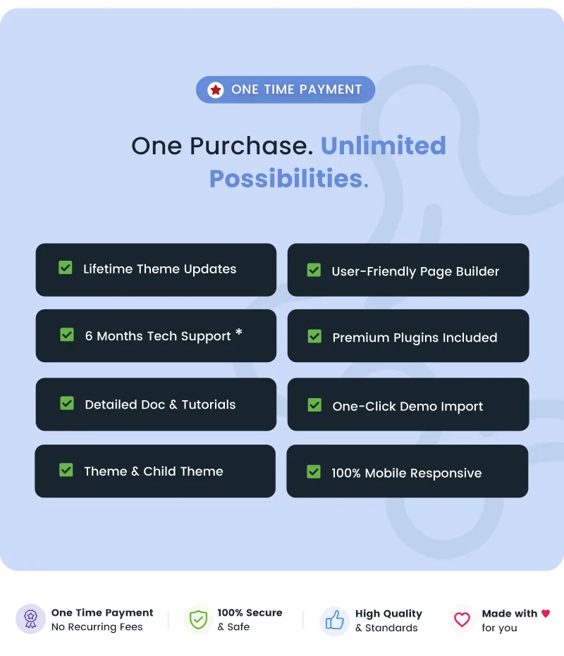
Pearl gives you a flexible starting point for creating a polished online presence without restricting your project to a single industry. Choose suitable layouts, organize your content, and shape your pages around your business goals. With its adaptable design approach, this Multipurpose Responsive Website Template helps you build a consistent and engaging website experience for your audience.
Pearl Inbuilt Demos and Page Layouts
- Explore the Pearl demo collection to discover page designs and layout ideas for different website purposes. The available demos help you plan a professional presentation for your brand, services, or portfolio.
- Use this Responsive HTML Template as a foundation for business homepages, company profiles, service pages, and other essential website sections, according to the layouts included with the template.
- Choose a suitable visual direction and organize your content into a clear journey that introduces your business, explains your offerings, and guides visitors toward relevant actions.
Pearl Blog and Content Layouts
- Present articles, company updates, industry insights, and announcements in an organized content layout that supports comfortable reading.
- Create a consistent editorial experience by arranging headings, paragraphs, images, and supporting content in a logical hierarchy.
- Adapt your content presentation to your website's purpose, whether you are sharing professional insights, promoting services, or publishing creative work.
- Use clear page titles, descriptive headings, meaningful internal links, and relevant content to help visitors navigate your website and understand each page.

Pearl Header Layouts and Navigation
- Create a recognizable first impression with a header that presents your brand identity and primary navigation clearly.
- Organize menu links to help visitors find important information, explore your services, and move between key website sections.
- Maintain a consistent visual direction by aligning your navigation, logo placement, typography, and calls to action with your overall website design.

Pearl Footer Layouts for Better Navigation
- Use your website footer to provide useful links, business details, contact information, and other supporting resources.
- Organize footer content to help visitors discover important pages without returning to the main navigation.
- Maintain a cohesive appearance by keeping footer typography, spacing, and visual styling consistent with the rest of your website.

Pearl Responsive Design for Modern Devices
- Pearl is designed to support a consistent browsing experience across desktop computers, tablets, and smartphones. Its responsive layout approach helps website content adapt to different screen widths.
- Thoughtful content organization and accessible navigation help visitors explore important information on a range of devices.
Flexible Image Presentation
- Use appropriately sized images and descriptive alternative text to make your pages more meaningful and accessible.
- Optimize image file sizes and dimensions to help reduce unnecessary page weight and improve loading performance.

1920x1080px
765kb

1170x658px
204kb

760x428px
108kb

370x208px
32kb