
In this article, we’ll explore 18 important Elements of a Website that every successful website should have. Creating a website that is both visually appealing and functional is a complex task that requires careful consideration of numerous elements.
To ensure that your website meets the needs of your visitors and achieves your desired goals, it’s essential to pay attention to specific key elements.
From layout and navigation to content and SEO optimization, we’ll cover everything you need to know to create a website that engages your audience and drives results. By incorporating these elements into your website design, you can boost your online presence, attract more traffic, and ultimately grow your business.
Key Components Every Modern Website Needs in 2026
1. Exceptional Typography
In the world of digital design, typography is one of the most important elements. It is the first thing that users see when they come to your website or app, and it can make or break their first impression.
That’s why choosing the right fonts for your project is important. But with so many options available, it can be tough to know where to start.
Here are a few tips for choosing the perfect fonts for your next website design project:
i) Know Your Typefaces
Understanding your typefaces is the foundation of great typography. Each font category — serif, sans-serif, script, or display — carries its own tone and personality. For example, serif fonts convey tradition and trust, while sans-serif fonts give a clean and modern impression. By knowing the strengths and emotional impact of each typeface, you can select the right one that aligns perfectly with your design goals and message.
ii) Consider Your Branding
Your font choices should always reflect your brand identity. Typography plays a major role in how people perceive your business — it’s a silent ambassador of your brand’s personality. For instance, a tech company might opt for a sleek, futuristic font, whereas a luxury brand could prefer elegant serif typefaces. Staying consistent with your branding ensures that your fonts complement your logo, colors, and tone, creating a unified visual experience.
iii) Use Contrasting Fonts
Contrast in typography helps create balance, hierarchy, and visual interest. By pairing two fonts that complement each other — such as a bold headline font with a simple body text font — you can make your content more engaging and easier to read. The key is to use contrast thoughtfully: mix styles that differ in weight, size, or tone, but still maintain harmony. Effective font pairing guides the reader’s eye and emphasizes key information in your design.
2. Color Palette
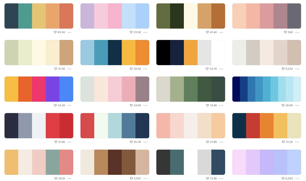
When it comes to modern web design, the color palette is an important element to consider. This is because the colors you use on your website can have a big impact on the overall look and feel of your site. Additionally, the colors you choose can also influence how users perceive your brand.
There are a few things to keep in mind when choosing a color palette for your website. First, you’ll want to consider the overall tone or mood that you want to convey with your site. Do you want it to be warm and inviting? Or cool and sleek? Once you’ve decided on the general tone, you can start picking out specific colors that will help achieve that goal.
It’s also important to keep in mind the demographics of your target audience when choosing colors. For example, if you’re targeting young adults, you’ll want to use brighter, more energetic colors. Alternatively, if your target audience is older adults, you’ll want to use more subdued and conservative colors.
Finally, don’t be afraid to experiment! Try out different color combinations until you find one that feels right for your website. And if you’re not sure where to start, there are plenty of online resources (like Adobe Color) that can help inspire your color palette.
3. White Space
White space is an essential element of modern web design. It is the space between elements on a page, and it can make or break the look of a website. Too much white space can make a site look empty and uninviting, while too little can make it look cluttered and busy. The key is to find the perfect balance for your site.
In general, designers use white space to create a visual hierarchy on a page. The eye needs somewhere to rest, and too many elements in close proximity can be overwhelming. White space can also be used to highlight important elements on a page or to create a sense of calmness and serenity.
When designing your website, consider how you can use white space to your advantage. Use it to create contrast, add visual interest, or simply give your users some breathing room. With a little bit of thought, you can turn white space into an asset instead of a liability.
4. Clear Navigation
In modern web design, minimal navigation is a key element. This means that the navigation of your website should be simple and easy to use, with as few clicks as possible to get to the desired content. Navigation is one of the most crucial elements of a website. It helps users find the information they need quickly and easily.
Clear navigation means organizing the website’s content in a logical and easy-to-understand manner, using headings, subheadings, and categories. An intuitive navigation menu should be visible on every page of the website and should guide users to the most important sections of the site.
Minimal navigation can be achieved by using a hamburger menu, a button that opens up a menu of links when clicked on. This is a popular method because it saves space on the screen and allows for a more clean and more minimal look. Another way to achieve minimal navigation is by using a sticky navbar, which is a navbar that stays at the top of the screen even when you scroll down. This allows users to always access your navigation without having to scroll back up to the top of the page.
Whichever method you choose, make sure that your navigation is clear and easy to use so that users can easily find what they are looking for on your site.
5. High-Quality Content
High-quality content is crucial for a successful website. It should be well-written, engaging, and informative, and should reflect the brand’s voice and values. The content should be structured in a way that is easy to read, with short paragraphs, bullet points, and headings. It should also be optimized for search engines, with relevant keywords and meta descriptions.
6. High-Quality Images & Videos
In order to have a modern website, it is important to incorporate high-quality images and videos. This will help to engage visitors and keep them on your website longer. Images and videos should be relevant to your content and match the overall tone of your site. In addition, they should be placed prominently on your pages so that visitors can easily see them.
All our themes are come with High-Quality Images & Videos Explore now.
7. Hero Banner
A hero banner is a large, eye-catching image or video that is typically placed at the top of a webpage. The purpose of a hero banner is to grab the attention of visitors and give them an overview of what the website is about.
While the most effective hero banners are those that are visually appealing and relevant to the website’s content, it’s also important to make sure that the text on the banner is easy to read and understand. The last thing you want is for visitors to be confused about what your website is about!
8. Call-To-Actions

The modern web is all about engaging users and driving conversions. A well-designed website will have clear and effective call-to-actions (CTAs) that encourage users to take the desired action.
CTAs are essential elements of a website that encourage users to take action, such as making a purchase or filling out a form. Effective CTAs should be placed strategically throughout the website, such as on the homepage, product pages, and in the footer. They should be clear, concise, and visible, with action-oriented language that encourages users to take the desired action.
Here are some important things to keep in mind when designing CTAs:
- Make them visually distinct: CTAs should be designed to stand out from the rest of the page. Use contrasting colors, large font sizes, and/or white space to make them stand out.
- Keep them above the fold: Users should not have to scroll down to see your CTAs. They should be prominently displayed on the page.
- Use actionable language: Use language that encourages users to take action, such as “Download Now” or “Sign Up Today”.
- Make them clickable: CTAs should be designed as clickable buttons or links. Do not use text that is not clickable (e.g. “Learn More”).
9. Hamburger Menus
Hamburger menus have become a staple in modern web design. They are used to provide easy access to navigation, while still keeping the design clean and uncluttered.There are a few things to keep in mind when designing a hamburger menu:
i. Make sure the menu is easily accessible. The user should be able to see and click on the menu icon from anywhere on the page. ii. Keep the number of items on the menu limited. Too many options can be overwhelming for the user. iii. Use clear and concise labels for each menu item. This will help the user understand what each option does. iv. Consider animation or other visual effects to make the menu more engaging. A simple sliding animation can make opening and closing the menu more fun for the user. v. Be sure to test your hamburger menu on different devices and screen sizes. What works well on a desktop may not work as well on a mobile device.10. Speed Optimization
When it comes to modern web design, speed is everything. Website loading speed is a crucial factor that can greatly impact user experience and search engine rankings. A website should load quickly, with a loading time of three seconds or less.
Users are now accustomed to instantaneous gratification, and if your site doesn’t load quickly, they’re likely to move on to another one that does. Not only do you need to ensure that your site loads quickly, but you also need to make sure that it’s optimized for mobile devices.
Optimizing images, minimizing plugins, and using a content delivery network (CDN) are all effective ways to improve website loading speed.
Here are a few tips for optimizing the speed of your site:
i. Use a content delivery network (CDN): A CDN is a global network of servers that deliver content based on the geographic location of the user. This means that users can access your content faster, no matter where they are in the world. ii. Optimize your images: Images can often be the biggest culprit when it comes to slow loading times. Make sure that you’re using compressed images, and consider using a service like Cloudinary or ImageOptim to further optimize your images for the web. iii. Minimize HTTP requests: Every time a user visits a page on your site, their browser has to send an HTTP request to your server in order to retrieve the content. The more HTTP requests your pages require, the longer they will take to load. To minimize HTTP requests, you can use techniques like CSS sprites and inline images. iv. Use caching. Caching is a way of storing frequently accessed data so that it can be retrieved more quickly.11. Cross Browser Compatible

Cross-browser compatibility is an increasingly important element of modern web design. With the proliferation of different mobile and desktop browsers, making sure a website or application looks and works perfectly across all platforms has become essential for both developers and users alike.
The challenges posed by cross-platform compatibility are manifold. Different devices render websites differently, often requiring significant coding changes to make content universally accessible. In addition, different operating systems have their own sets of rules when it comes to loading resources from servers, meaning that code must be written in such a way as not to cause conflicts between them.
Moreover, users may be using outdated versions of popular browsers which may require additional testing in order for the site’s layout to appear correctly on those platforms or support features such as HTML 5 audio or video playback.
We have Fast loading & high quality WordPress Themes & Templates Buy now.
12. Mobile-Optimized Design
Responsive design is an important element of a website that ensures it looks great and functions well on various devices, including desktops, tablets, and smartphones. Responsive design means that the website adapts to the screen size and orientation of the device, providing an optimal user experience regardless of the device being used.
Mobile-optimized design requires a deep understanding of how each platform works as well as what features will be necessary for optimal use on each device type. Designers need to create layouts that adjust automatically based on screen size while also accounting for smaller screens which may require simpler navigations or fewer images per page.
Additionally, designers should consider the technical limitations such as speed and loading time differences across various platforms so users have a uniform experience regardless of the device type used to access the content.
Get Mobile Optimized WordPress Themes here.
Designing with mobile optimization in mind helps provide users with an intuitive experience regardless of what kind of device they are using which is essential for high engagement rates in today’s competitive online environment.
Companies who neglect this area risk losing out customers due to poor usability when accessed from a smartphone or tablet compared to desktop devices which could lead to a significant loss in sales or worse, damage brand reputation by establishing negative customer reviews online about their product offerings or services provided through their website platform.
13. SEO Optimization

SEO optimization involves a variety of tactics such as keyword research, content optimization, link building, and meta tags management. Each strategy should be tailored according to the target audience’s interests and needs in order for the website content to rank high in the SERPs (search engine result pages).
Keyword research looks into popular searches related to keywords that are frequently used by users when searching online; this can help inform your website’s layout so that people can find what they need quickly.
Content optimization involves producing engaging copy with valuable information while also providing enough context so that it appeals to both readers and search engines alike; this includes using appropriate headings/subheadings, alt tags for images/videos, etc.,
Meta descriptions as well as unique title tags all contribute towards ranking higher on SERPs. Link building includes creating backlinks from other websites within your niche or industry the more reputable sites you have linking back to yours will boost your authority with major search engines like Google over time.
Get SEO Optimized WordPress Themes here.
14. Trust-Building Elements
In 2023, building trust with website visitors is of utmost importance due to the increasing emphasis on online security, data privacy, and user experience. With the ever-growing number of websites and online businesses, users have become more discerning about where they share their personal information, make purchases, or engage with content.
Therefore, it’s crucial for websites to establish credibility and reliability to encourage users to interact with their platform and ultimately convert into customers. This is where trust signals play a significant role.
Trust signals are elements displayed on a website that help instill confidence in visitors by demonstrating the website’s authenticity and positive user experiences. Display trust signals like customer testimonials, reviews, security badges, and privacy policies to instill confidence in your brand and encourage users to interact with your website.
15. Contact Information and Support
Contact information is a critical element of a website that allows customers to get in touch with the business. It should be easily accessible and prominently displayed on every page of the website. Providing contact information such as a phone number, email address, or a contact form allows customers to reach out to you easily. It enables direct communication, allowing users to ask questions, seek clarifications, or provide feedback. Engaging with customers promptly fosters a positive impression of your brand and shows that you value their inquiries.
Displaying contact information on your website enhances your brand’s credibility. It reassures visitors that your website is legitimate and transparent, as scammers and fraudulent websites often avoid providing contact details.
Having a support system in place ensures that customers receive timely assistance when facing issues with your products or services. Whether it’s technical problems, billing inquiries, or general assistance, offering customer support creates a positive experience and encourages repeat business.
Effective customer support is vital for building strong relationships with your customers. When you address their concerns and provide helpful solutions, it shows that you value their satisfaction and are committed to meeting their needs.
16. Search Functionality

Implement a robust search feature that allows users to find specific content or products quickly. A search function makes it easier for users to find specific content or products on your website. Instead of navigating through menus and categories, users can directly enter keywords or phrases related to what they are looking for. This convenience significantly improves the overall user experience.
This is particularly important for websites with extensive content or a vast product catalog. Users can find what they are looking for in seconds, reducing the time and effort required to locate relevant information. A search feature encourages users to interact more with your website. When users can find what they want quickly, they are more likely to stay on your site longer, explore more pages, and engage with your content or products, leading to increased user engagement.
17. Accessibility Compliance
Accessibility is of utmost importance for a website because it ensures that all individuals, regardless of their abilities or disabilities, can access and interact with the content effectively. Creating an inclusive digital environment through website accessibility is not only a legal and ethical responsibility but also provides numerous benefits.
Accessibility ensures that people with disabilities, such as visual, auditory, motor, or cognitive impairments, can navigate and consume content on your website without barriers. It promotes inclusivity, giving everyone an equal opportunity to access information and participate in online activities.
In many countries, web accessibility is legally mandated. Non-compliance with accessibility standards may result in legal consequences and potential discrimination lawsuits. Adhering to accessibility guidelines helps your website meet these legal requirements.
18. Analytics
Analytics is an important element of a website that allows businesses to track and measure website performance. This includes metrics such as website traffic, user behavior, conversion rates, and more. Analytics tools such as Google Analytics can provide valuable insights into website performance and help businesses make data-driven decisions to improve their website’s effectiveness.
Frequently Asked Questions About Key Website Elements for 2026
What are the essential elements every website should have in 2026?
Essential elements include responsive design, fast loading speed, intuitive navigation, high-quality content, SEO optimization, clear call-to-actions, security features, and mobile-friendly layouts to ensure a seamless user experience.
Why is website performance critical for user experience?
Website performance, including speed and responsiveness, directly impacts user engagement and retention. Fast-loading and smooth websites improve user satisfaction, reduce bounce rates, and positively influence search engine rankings.
How can I make my website visually appealing while keeping it functional?
Balance aesthetics and functionality by using a clean layout, readable fonts, engaging visuals, and intuitive navigation. Ensure your design aligns with your brand identity while prioritizing usability and accessibility for all users.
Conclusion
In conclusion, a successful website is built on a foundation of key elements that work together seamlessly to deliver a great user experience. By paying attention to the Website’s important elements we’ve covered in this article, you can ensure that your website is optimized for functionality, aesthetics, and SEO.
These elements work together to provide an optimal user experience, increase engagement, and drive conversions. By prioritizing these elements in website design and development, businesses can create a website that reflects their brand’s values and goals and helps them achieve success online.
Build a Website That Stands Out in 2026!
Don’t just build a website — build a brand. Choose a 2026-optimized WordPress theme that’s fast, secure, and designed to impress every visitor.