
Join us as we delve into the world of web design and uncover the Common Web Design Mistakes that should be avoided. By the end of this article, you’ll have a comprehensive understanding of the potential pitfalls and the knowledge to create a successful and user-friendly website.
In today’s digital landscape, having a well-designed website Theme is crucial for businesses and individuals alike. However, many people fall into common web design traps that can hinder the effectiveness and success of their online presence. Whether you’re a beginner or an experienced designer, it’s essential to be aware of these common mistakes and how to avoid them.
1. Poor Typography

Typography plays a crucial role in web design as it directly affects the readability and user experience of your website. Unfortunately, many web designers make the mistake of overlooking typography, leading to poor legibility and user engagement. Here are some common typography mistakes to avoid:
- Illegible Fonts: Choosing decorative or overly stylized fonts that are difficult to read can be a major turnoff for visitors. It’s important to prioritize legibility over aesthetic appeal. Select fonts that are clear, well-spaced, and easily readable, especially for body text. Sans-serif fonts are often preferred for online content due to their simplicity and clarity.
Inconsistent Font Styles: Inconsistency in font styles across your website can make it look unprofessional and disjointed. Stick to a limited set of fonts and use them consistently throughout your website. Establish a hierarchy by using different font weights, sizes, and styles (such as bold or italic) to distinguish headings, subheadings, and body text.
Poor Contrast: Insufficient contrast between the text and the background can make reading difficult, especially for those with visual impairments. Avoid using light-colored text on light backgrounds or dark text on dark backgrounds. Aim for a high contrast ratio to ensure that the text stands out and is easily readable.
Lack of Sufficient Line Spacing: Insufficient line spacing, also known as leading, can make the text feel cramped and overwhelming. Ensure there is enough space between lines to improve readability and allow the eyes to move smoothly from one line to another. Adequate line spacing also helps prevent the text from blending together, especially for longer paragraphs.
Overuse of Text Effects: Excessive use of text effects like shadows, gradients, and animations can distract and confuse users. While some effects can enhance the visual appeal, use them sparingly and purposefully. Keep the focus on the content and make sure the text remains the primary element.
Ignoring Responsive Typography: With the prevalence of mobile devices, it’s crucial to consider how your typography adapts to different screen sizes. Avoid using font sizes that are too small to read on mobile devices and ensure that the line lengths are optimized for easy reading.
To improve your typography, start by selecting appropriate fonts that align with your brand’s personality and objectives. Test the readability of your chosen fonts across different devices and screen resolutions. Pay attention to spacing, contrast, and hierarchy to create a visually pleasing and readable typography system.
Remember, good typography enhances the overall user experience and helps convey your message effectively. By avoiding these typography mistakes and implementing best practices, you can ensure that your website’s content is easily readable, visually appealing, and engages your audience.
2. Using an unsuitable color scheme
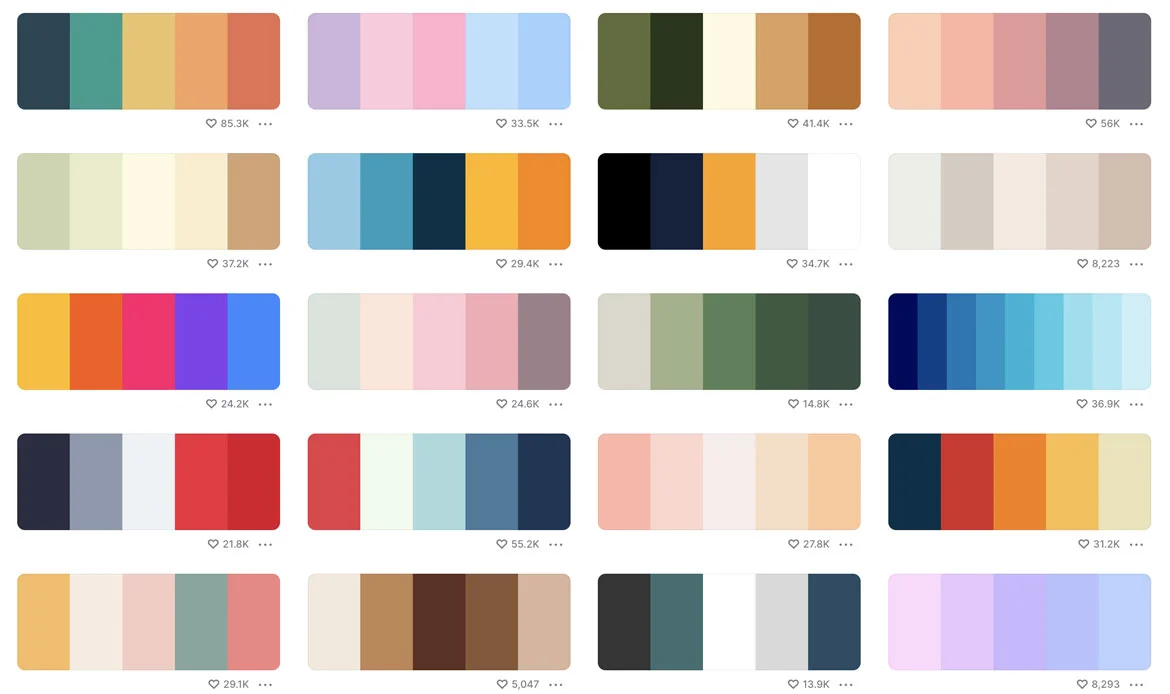
Color plays a crucial role in web design as it sets the tone, creates visual interest, and evokes emotions. However, choosing an unsuitable color scheme can have a negative impact on the overall user experience of your website. Here are some common mistakes to avoid when it comes to selecting a color scheme:
Clashing Colors: Using colors that clash or create visual discord can make your website appear unappealing and difficult to navigate. It’s important to select colors that complement each other and create a harmonious visual experience. Consider using color theory principles such as complementary, analogous, or monochromatic color schemes to ensure a pleasing combination.
Poor Color Contrast: Insufficient contrast between the text and the background can make it challenging for users to read the content. Avoid using low-contrast color combinations, such as light text on a light background or dark text on a dark background. Ensure that there is enough contrast to make the text stand out and be easily readable.
Overuse of Bright or Vibrant Colors: While bold and vibrant colors can add visual impact, using them excessively can be overwhelming and distract from the content. Balance the use of bright colors with more neutral tones to create a visually appealing and balanced color scheme. Additionally, consider the context and purpose of your website. For example, a professional website may benefit from a more subdued and sophisticated color palette.
Ignoring Color Psychology: Colors have psychological associations and can evoke specific emotions in users. Failing to consider the psychological impact of your chosen colors can result in a mismatch between the intended message and the user’s perception. Research the psychological meanings associated with different colors and choose a color scheme that aligns with the desired emotions and brand identity.
Inconsistent Color Usage: Inconsistency in color usage across different pages or sections of your website can create a disjointed and confusing user experience. Establish a consistent color palette and apply it consistently throughout your website. This helps create visual harmony and reinforces your brand identity.
Lack of Accessibility Considerations: Accessibility is an essential aspect of web design. Ensure that your color scheme meets accessibility guidelines, such as providing sufficient color contrast for users with visual impairments. Test your color choices using accessibility tools to ensure that your website is inclusive and usable for all users.
When selecting a color scheme for your website, take into account your brand identity, target audience, and the purpose of your website. Experiment with different color combinations, seek inspiration from successful websites, and gather feedback from users to determine the most suitable color scheme.
By avoiding these common mistakes and considering the impact of color on user experience, you can create a visually appealing and engaging website that effectively communicates your message and enhances the overall user experience.
3. Slow Loading site
In today’s fast-paced digital world, users have little patience for slow-loading websites. A slow-loading site can lead to frustrated visitors, high bounce rates, and a negative impact on your search engine rankings. To ensure a smooth and efficient user experience, here are some common mistakes to avoid related to slow-loading websites:
Unoptimized Images: Large and unoptimized images are one of the primary culprits behind slow-loading sites. Uploading high-resolution images without compressing or resizing them can significantly increase the page load time. Optimize your images by compressing them without compromising too much on quality. Additionally, consider using modern image formats like WebP, which can offer better compression and faster loading times.
Excessive Plugins and Scripts: While plugins and scripts can enhance the functionality and interactivity of your website, an over-reliance on them can slow down your site. Each plugin or script adds additional requests to the server, increasing the load time. Review your plugins and scripts regularly, and only keep the ones that are necessary. Opt for lightweight alternatives or consider custom-coding certain functionalities to minimize the reliance on external scripts.
Bloated Code and Excessive CSS/JavaScript: Poorly optimized code, including excessive CSS and JavaScript files, can significantly impact your site’s loading speed. Minify your code by removing unnecessary spaces, line breaks, and comments. Combine and compress CSS and JavaScript files to reduce the number of HTTP requests made by the browser. Additionally, consider loading scripts asynchronously or deferring their loading to improve overall site performance.
Regularly monitor your website’s loading speed using tools like Google PageSpeed Insights or GTmetrix. Identify areas for improvement and take necessary steps to optimize your site’s performance. By avoiding these common mistakes and prioritizing site speed, you can provide users with a fast and seamless browsing experience, keeping them engaged and increasing the chances of conversions and positive user interactions.
4. Cluttered Layouts
Excessive Content and Visual Elements: One of the main culprits of a cluttered layout is an overload of content and visual elements. Avoid cramming too much information onto a single page. Instead, prioritize the most important content and streamline your design. Use clear headings, concise paragraphs, and bullet points to make the content more scannable and digestible. Similarly, be selective with visual elements such as images, videos, and icons, ensuring they enhance the content rather than overwhelm it.
- Poor Organization and Hierarchy
- Clashing Colors and Inconsistent Typography
- Lack of Whitespace
- Unorganized Navigation
- Inconsistent Layout Across Pages
By avoiding these common mistakes and focusing on creating a clean and organized layout, you can provide users with a visually pleasing and intuitive browsing experience. Remember, simplicity and clarity are key to engaging and retaining your website visitors, enabling them to find the information they seek quickly and effortlessly.
5. Poor Navigation
Navigation is a crucial aspect of web design that directly impacts the user experience. A poorly designed navigation system can lead to frustration, and confusion, and ultimately drive visitors away from your website. To ensure a seamless browsing experience for your users, it is important to avoid the following common mistakes related to poor navigation:
- Complex Navigation Menus
- Unclear Labels and Descriptions
- Lack of Consistency
- Hidden or Hard-to-Find Navigation
- Lack of Search Functionality
- Non-Mobile-Friendly Navigation
By addressing these common navigation mistakes, you can enhance the usability and user experience of your website. A well-designed and intuitive navigation system allows users to navigate your site effortlessly, find the information they need, and engage with your content more effectively. Ultimately, this improves user satisfaction, encourages longer visits, and increases the chances of achieving your website’s goals.
6. Displaying multiple CTAs
Displaying multiple calls-to-action (CTAs) on a single web page is a common web design mistake that can confuse and overwhelm visitors. While it may seem like a good idea to provide various options and opportunities for engagement, it often leads to decision paralysis and dilutes the effectiveness of each CTA.
When multiple CTAs are scattered throughout a page, visitors may struggle to determine which action to take or become unsure of the primary goal of the website. This can result in reduced conversions and user frustration.
To avoid this mistake, it’s important to focus on a clear and singular primary call to action. Identify the main objective of your website or page and ensure that the corresponding CTA stands out prominently. By providing a clear and concise direction, you guide your visitors toward the desired action and increase the likelihood of conversion.
7. Ineffective Use of White Space

When white space is not utilized effectively, it can result in a cluttered and overwhelming design. Dense and crowded layouts make it difficult for visitors to focus on the content and navigate through the website. It can also make the page appear visually unappealing and unprofessional.
To avoid this mistake, it is crucial to understand the importance of white space and incorporate it intentionally into your design. By strategically adding breathing room between elements, you create a sense of visual hierarchy and improve readability. White space can help separate different sections, highlight important content, and create a clean and organized look.
Consider the balance between content and white space, ensuring that neither element overwhelms the other. Experiment with different spacing options to find the optimal balance that aligns with your brand aesthetic and enhances user engagement. Remember, less is often more when it comes to the effective use of white space.
8. Lack of Accessibility
Lack of accessibility is a significant web design mistake that can exclude a large portion of users from accessing and interacting with your website. Accessibility refers to designing and developing websites that are inclusive and can be easily accessed and used by people with disabilities or impairments.
When a website lacks accessibility features, it can prevent individuals with visual, hearing, motor, or cognitive disabilities from fully engaging with the content. This not only hinders their user experience but also goes against the principles of inclusivity and equal access on the web.
To avoid this mistake, it’s crucial to consider accessibility throughout the entire web design process. Some key aspects to focus on include:
- Alt Text
- Proper Heading Structure
- Color Contrast
- Keyboard Accessibility
- Captions and Transcripts
- Clear and Simple Language
By incorporating these accessibility practices into your web design, you create a more inclusive and user-friendly experience for all visitors. Remember, accessible design is not only a legal and ethical requirement but also opens your website to a wider audience, improves usability, and enhances overall user satisfaction.
9. Lack of Mobile Responsiveness
Lack of mobile responsiveness is a significant web design mistake that can lead to a poor user experience for visitors accessing your website on mobile devices. With the increasing use of smartphones and tablets, it’s essential to ensure that your website is fully optimized and responsive across different screen sizes and resolutions.
When a website lacks mobile responsiveness, it can result in elements being misaligned, the text being too small to read, or important content being cut off. This not only frustrates users but also negatively impacts your website’s usability, engagement, and overall conversion rates.
To avoid this mistake, it’s crucial to prioritize mobile responsiveness in your web design. Here are some key considerations:
Responsive Design: Adopt a responsive web design approach, where your website layout and elements automatically adjust and adapt to different screen sizes. This ensures that your website looks and functions well on mobile devices.
Mobile-Friendly Navigation: Optimize your website’s navigation for mobile users by using a hamburger menu, clear and concise labels, and easy-to-tap buttons. Make sure that users can easily access all the important sections and pages of your website on mobile.
Font and Button Sizes: Ensure that your website’s text is legible on smaller screens by using an appropriate font size. Similarly, make sure that buttons and interactive elements are large enough and easy to tap with a finger.
Optimized Media: Optimize images and videos to reduce file sizes and improve loading times on mobile devices. This helps to minimize data usage and improve the overall performance of your website.
User-Friendly Forms: Simplify and streamline forms to make it easier for mobile users to input information. Use autofill options, minimal input fields, and clear instructions to enhance the user experience.
Test Across Devices: Regularly test your website across different mobile devices and screen sizes to identify any responsiveness issues and make necessary adjustments.
By ensuring mobile responsiveness, you provide a seamless and enjoyable browsing experience for your mobile users, leading to increased engagement, higher conversion rates, and improved overall user satisfaction. Remember, with the growing dominance of mobile devices, optimizing your website for mobile is no longer an option but a necessity.
10. Ignoring SEO Best Practices
Ignoring SEO best practices is a critical web design mistake that can hinder your website’s visibility and organic traffic from search engines. While an aesthetically pleasing design is important, it’s equally essential to optimize your website for search engines to ensure that it ranks well and attracts relevant organic traffic.
Here are some common SEO mistakes to avoid:
Poor Keyword Research: Neglecting proper keyword research can result in your website targeting the wrong keywords or missing out on valuable opportunities. Conduct thorough keyword research to identify relevant and high-volume keywords that align with your content and target audience.
Lack of Title Tags and Meta Descriptions: Title tags and meta descriptions are crucial for SEO as they provide concise and informative summaries of your web pages in search engine results. Failing to optimize these elements or leaving them blank can hinder your website’s visibility and click-through rates.
Absence of Header Tags: Header tags (H1, H2, etc.) are important for organizing your content and signaling its hierarchy to search engines. Properly utilizing header tags not only improves the readability of your content but also helps search engines understand the structure and context of your web pages.
Missing ALT Tags for Images: ALT tags provide alternative text descriptions for images, making them accessible to visually impaired users and assisting search engines in understanding the content of your images. Neglecting ALT tags can result in missed opportunities for image search traffic and hinder overall SEO efforts.
Poor URL Structure: Utilizing clean and descriptive URLs is vital for both users and search engines. A messy URL structure with random strings of characters or generic URLs can negatively impact user experience and make it harder for search engines to crawl and understand your website’s content.
Slow Page Speed: Page speed is a crucial factor in both user experience and SEO. Slow-loading pages can lead to higher bounce rates and lower search engine rankings. Optimize your website’s performance by minimizing file sizes, leveraging caching techniques, and optimizing code to ensure fast and responsive page loading.
Lack of Mobile Optimization: With the increasing use of mobile devices, optimizing your website for mobile is no longer optional. Ignoring mobile optimization can lead to poor user experience, lower search engine rankings, and missed opportunities to reach a significant portion of your target audience.
By paying attention to SEO best practices during the web design process, you can ensure that your website is search engine friendly, attracts organic traffic, and improves its overall visibility and online presence. Remember, SEO should be an integral part of your web design strategy to maximize the potential of your website.
Essential Tips for Beginners to Avoid Common Web Design Errors
Web design is more than aesthetics — it’s about creating a seamless, intuitive experience for your visitors. Beginners often make simple mistakes that can harm usability, engagement, and conversions. Avoiding these pitfalls from the start ensures your website is professional, user-friendly, and effective.
1. Cluttered Layouts
Overloading pages with too many elements confuses visitors. Stick to a clean design with ample white space, concise content, and a clear visual hierarchy to guide users naturally.2. Poor Navigation
Navigation is the backbone of your site. Complex menus or hidden links frustrate visitors. Use simple, descriptive menu items, and keep the navigation consistent across all pages.3. Slow Loading Speed
A slow website can drive users away instantly. Optimize images, minimize heavy scripts, and leverage caching to improve load times. Fast websites improve both user experience and search engine rankings.4. Inconsistent Branding
Fonts, colors, and imagery should be cohesive. Inconsistent branding confuses visitors and weakens credibility. Stick to a unified style guide across your website.5. Ignoring Mobile Responsiveness
With the majority of users browsing on mobile devices, a non-responsive website leads to poor user experience. Ensure your site adapts smoothly to different screen sizes.6. Hard-to-Read Content
Text that’s too small, low-contrast, or poorly structured deters readers. Use readable fonts, proper line spacing, and headings to make your content digestible.7. Lack of Clear Call-to-Actions (CTAs)
Visitors should know exactly what steps to take next. Place prominent CTAs with action-oriented text to guide users toward your goals, whether it’s subscribing, purchasing, or contacting.8. Overuse of Pop-Ups
Pop-ups can be distracting or even annoying. Use them sparingly and ensure they appear at the right moment, like exit-intent pop-ups or newsletter signups.9. Neglecting SEO Basics
Beautiful design won’t help if your site isn’t discoverable. Include proper meta tags, headings, alt text for images, and optimized content to improve search engine visibility.10. Forgetting User Testing
Assuming your design works without testing is a mistake. Conduct usability tests to gather feedback and refine your website based on real user interactions.Frequently Asked Questions About Avoiding Web Design Mistakes
What are the most common web design mistakes beginners make?
Common mistakes include cluttered layouts, poor navigation, slow page loading, inconsistent fonts and colors, and ignoring mobile responsiveness. These issues can frustrate users and reduce engagement.
How can I improve website usability as a beginner designer?
Focus on clean, intuitive layouts, clear navigation menus, fast-loading pages, and mobile-friendly design. Prioritizing user experience ensures visitors can easily find information and interact with your website.
Why is avoiding these mistakes important for website success?
Avoiding design mistakes enhances user experience, reduces bounce rates, and builds credibility. A well-designed website keeps visitors engaged, encourages conversions, and strengthens your online presence.
Conclusion
In conclusion, it is evident that avoiding common mistakes is crucial for creating a successful and user-friendly website. By addressing these mistakes and implementing best practices, you can significantly enhance the user experience, engage visitors, and achieve your desired goals.
Throughout this article, we have explored a range of web design blunders that can hinder the effectiveness of your website. From poor navigation and cluttered layouts to slow-loading pages and lack of responsiveness, each mistake has the potential to turn away visitors and negatively impact your online presence.
Avoid Costly Web Design Mistakes from Day One
Avoiding common web design mistakes is essential for creating a professional, user-friendly website. From cluttered layouts to slow-loading pages, beginners often overlook critical elements that impact performance and user experience. With Zozotheme, you can select carefully designed WordPress themes that are SEO-optimized, responsive, and error-free, helping you build a flawless website while staying clear of common pitfalls.