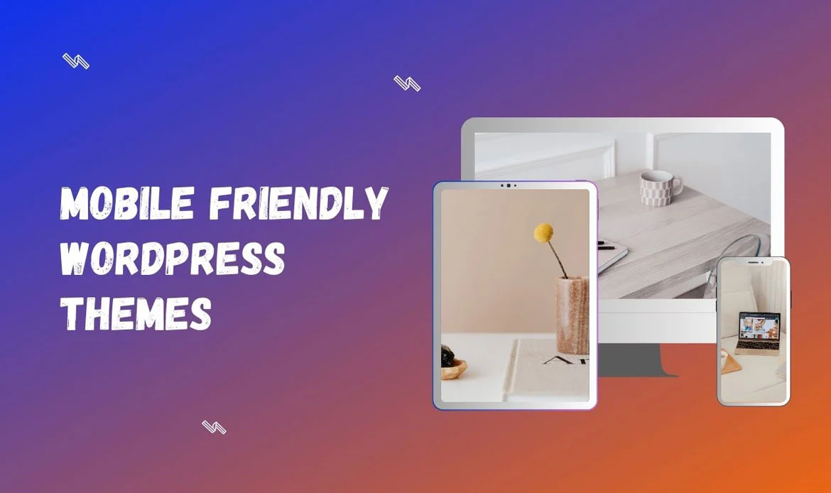
Welcome to our comprehensive guide showcasing the best of mobile-friendly WordPress themes for the year. In today’s digital landscape, where mobile devices reign supreme, it is essential to ensure your website not only looks stunning but also functions flawlessly on smartphones and tablets.
Whether you’re a business owner, blogger, or creative professional, having a mobile-responsive website is paramount to reach and engage with your audience effectively.
In this article, we have meticulously curated a handpicked selection of the best 20 mobile-friendly WordPress Templates available. These themes have been chosen for their exceptional design, seamless responsiveness, and user-friendly features. From sleek and minimalist designs to bold and vibrant layouts, our list covers a wide range of styles to cater to diverse tastes and industries.
Top 20 Responsive WordPress Themes Designed for Seamless Mobile Experience in 2026
1. Tranzkart
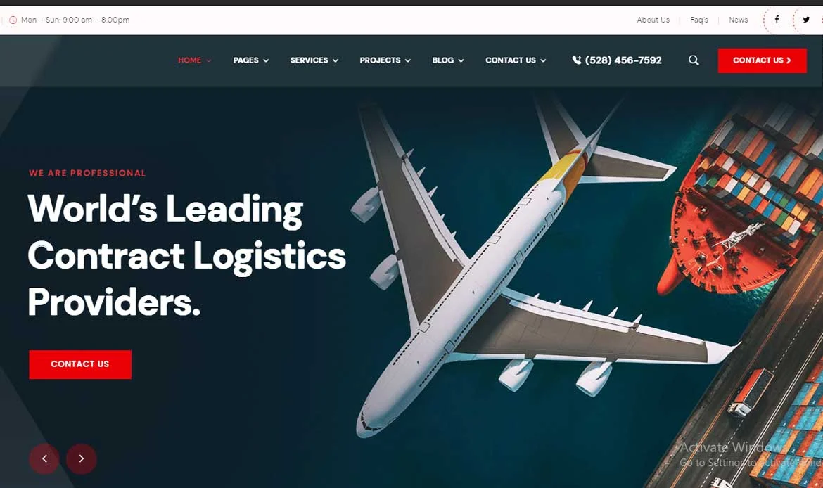
Tranzkart Transportation WordPress Theme for Logistics is the ultimate solution for logistics companies and transportation service providers looking for a mobile-friendly online presence. With its sleek and responsive design, Tranzkart ensures that your website remains visually stunning and fully functional on mobile devices.
Additionally, Tranzkart’s mobile-friendly nature extends beyond its visual appeal. This theme is optimized for quick loading times, ensuring that users on mobile devices can access information swiftly and effortlessly. With Tranzkart, your transportation website will adapt seamlessly to various screen sizes and resolutions, providing a consistent and user-friendly experience across all devices.
Key Highlights
- Optimized for logistics and cargo websites
- One-click demo import for quick setup
- Advanced shipment tracking integration
- Fully responsive on all devices
- SEO-friendly code for better search ranking
2. Stamin
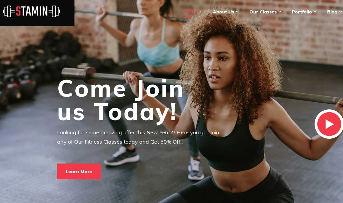
Stamin Fitness and Gym WordPress Theme is a cutting-edge and mobile-friendly solution designed specifically for fitness enthusiasts and gym owners. With its responsive design and mobile-friendly layout, Stamin ensures that your website looks and functions flawlessly across various mobile devices.
This customizable theme offers a seamless user experience on smartphones and tablets, allowing your clients to easily access class schedules, book appointments, and explore fitness programs while on the go. Stamin’s mobile-friendly features empower you to engage with your audience effectively, boost membership conversions, and establish a strong online presence in the competitive fitness industry.
Key Highlights
- Designed for gyms and fitness centers
- Customizable workout and class schedules
- Membership and subscription integration
- High-performance, mobile-ready design
- Optimized for speed and SEO
3. Gigas
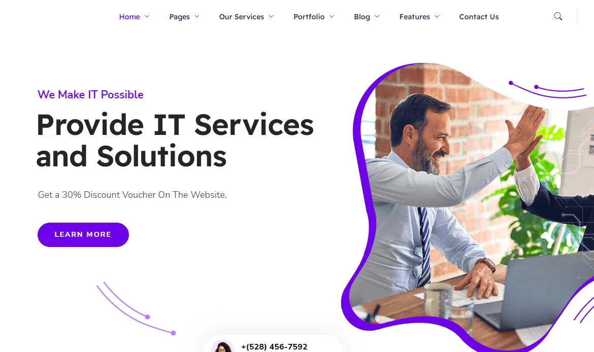
Gigas SaaS WordPress Theme is a cutting-edge and mobile-friendly solution crafted for software as a service (SaaS) providers. With its modern design and responsive layout, Gigas ensures that your website remains visually captivating and fully functional on mobile devices.
This theme’s mobile-friendly features guarantee a seamless user experience, allowing potential clients to easily explore your SaaS offerings, sign up for trials, and access key information from their smartphones or tablets. Gigas’ mobile-friendly design also ensures fast loading times, enabling users to quickly engage with your SaaS platform on the go.
Key Highlights
- SaaS-focused modern WordPress theme
- Multiple ready-to-use demo layouts
- Drag-and-drop page builder support
- Fully responsive and retina-ready
- Integrated SEO and performance optimization
4. Interiar
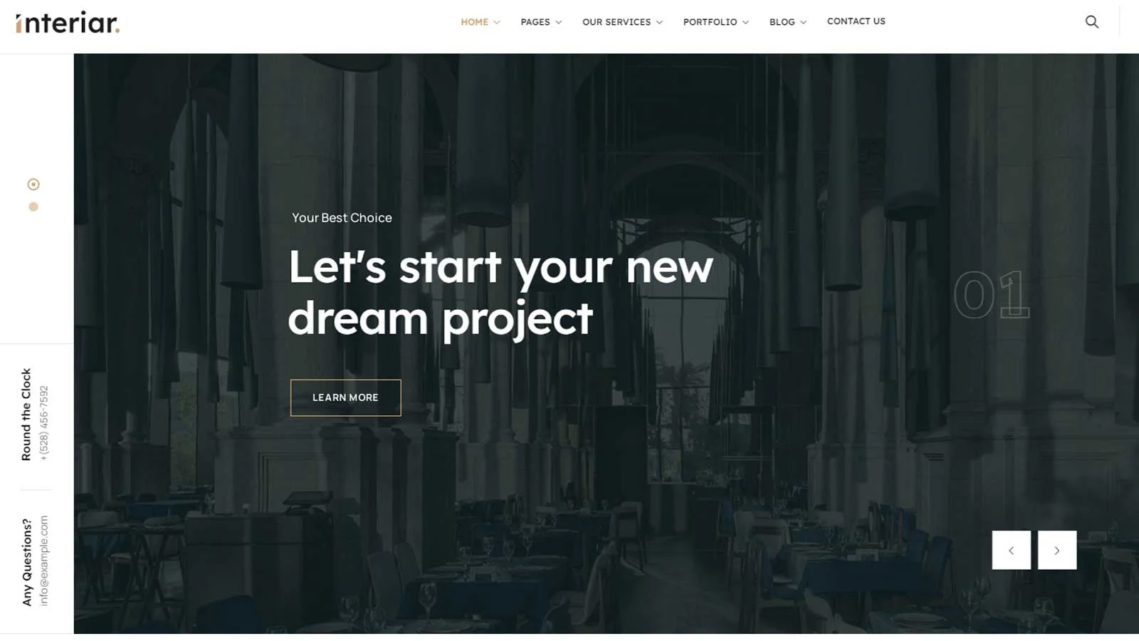
Interiar Interior Design WordPress Theme is a sleek and mobile-friendly solution tailored specifically for interior designers and decorators. With its modern and responsive design, Interiar ensures that your website looks stunning and functions seamlessly across all mobile devices.
Interiar’s mobile-friendly features empower you to showcase your creativity on the go, attract clients, and establish a strong online presence in the competitive interior design industry. Experience the power of mobile responsiveness with Interiar and take your interior design website to new levels of success.
Key Highlights
- Perfect for interior design and architecture websites
- Beautiful portfolio and project showcase options
- Responsive layouts for mobile and tablet
- Easy customization with theme options
- Optimized for SEO and fast loading
5. Medcure
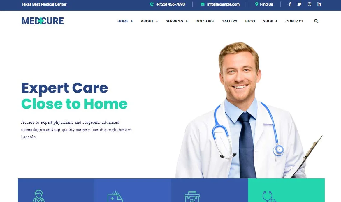
Medcure Health and Medical Care WordPress Theme is a comprehensive and mobile-friendly solution designed to meet the specific needs of health professionals, clinics, hospitals, and medical organizations. With its modern design and responsive layout, Medcure ensures that your website remains visually stunning and fully functional across all mobile devices.
This theme’s mobile-friendly features provide an exceptional user experience, allowing patients to easily access important information, book appointments, and explore healthcare services from their smartphones or tablets. Medcure’s mobile-friendly design extends beyond aesthetics to prioritize user convenience and accessibility.
Key Highlights
- Medical and healthcare-focused design
- Doctor and appointment management features
- Responsive and mobile-friendly layout
- Compatible with WooCommerce and plugins
- SEO optimized for higher search visibility
6. Igual
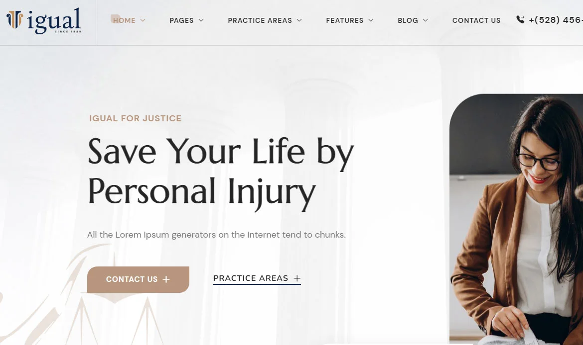
Igual Law Firm WordPress Theme is a sophisticated and mobile-friendly solution meticulously designed for law firms, legal professionals, and legal service providers. With its sleek and responsive design, Igual ensures that your website looks impeccable and functions seamlessly across all mobile devices.
Igual’s mobile-friendly features go beyond aesthetics to prioritize usability and convenience. With its responsive design, your website automatically adjusts to different screen sizes, ensuring optimal readability and intuitive navigation for mobile users. This theme’s mobile-friendly layout guarantees an exceptional user experience, allowing potential clients to easily access legal services, explore practice areas, and contact your firm from their smartphones or tablets.
Key Highlights
- Creative multipurpose WordPress theme
- Modern, fully responsive design
- Supports page builders like Elementor
- Highly customizable color and typography options
- Built-in SEO and performance enhancements
7. Mist
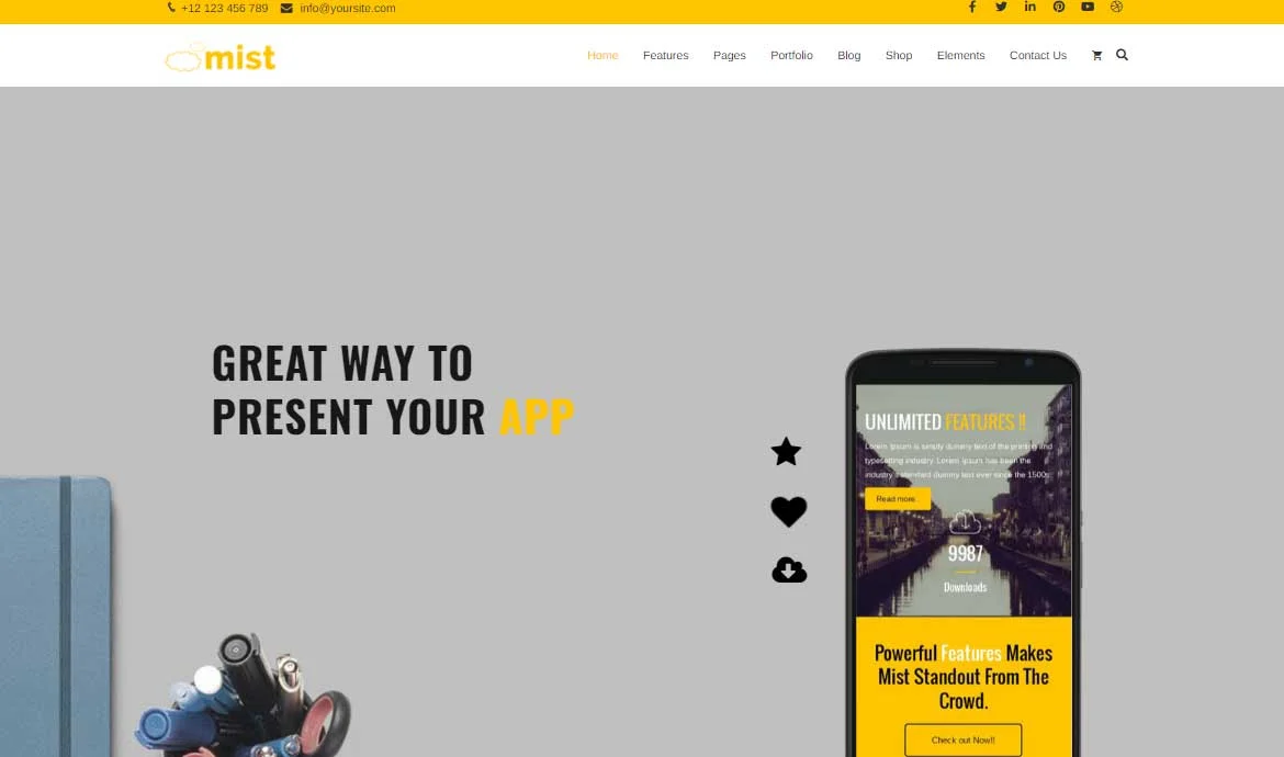
Mist Advanced Multi-Concept Theme is a versatile and mobile-friendly solution designed to elevate the online presence of businesses and professionals across various industries. With its creative and responsive design, Mist ensures that your website looks stunning and functions seamlessly on all mobile devices.
Mist offers a wide range of features and customization options, making it suitable for businesses and professionals across diverse sectors. Whether you’re a creative agency, freelancer, corporate entity, or e-commerce store, Mist provides the flexibility to create a tailored online presence that resonates with your target audience.
Key Highlights
- Advanced multi-concept theme for all niches
- Pre-built demos for quick setup
- Drag-and-drop page builder integration
- Responsive, retina-ready layouts
- SEO-friendly and fast-loading design
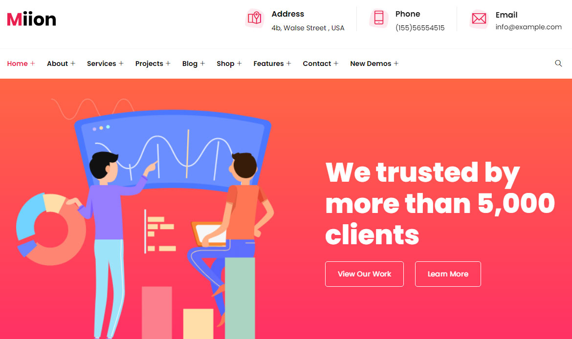
8. Miion
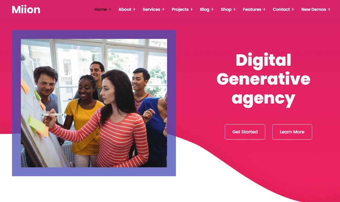
Miion Multi-Purpose WordPress Theme is a dynamic and mobile-friendly solution designed to cater to a wide range of industries and businesses. With its sleek and responsive design, Miion ensures that your website looks stunning and functions seamlessly across all mobile devices.
Moreover, Miion’s mobile-friendly design contributes to improved search engine visibility. With a responsive layout, your website is more likely to rank higher in mobile search results, attracting a wider audience and driving organic traffic to your website. Miion is a versatile multi-purpose theme that offers a wide array of features and customization options, making it suitable for businesses of all types.
Key Highlights
- Multipurpose modern WordPress theme
- Flexible demo layouts for any business
- Supports Elementor and other builders
- Fully responsive on all devices
- Optimized for SEO and speed
9. Briddge
Briddge Corporate WordPress Theme is a professional and mobile-friendly solution designed to elevate the online presence of corporate entities, businesses, and professionals. With its sleek and responsive design, Briddge ensures that your website looks impeccable and functions seamlessly across all mobile devices.
Mobile responsiveness is not just about adaptability; it also impacts website performance. Briddge is optimized for fast loading times, enabling quick access to your content, images, and functionality. This enhances the user experience and encourages visitors to stay engaged with your website, ultimately increasing the chances of conversions and achieving your business objectives.
Key Highlights
- Corporate and business-focused theme
- Multiple homepage and inner page designs
- Responsive and retina-ready layouts
- Supports drag-and-drop builders
- SEO-optimized for better visibility
10. Inzofin
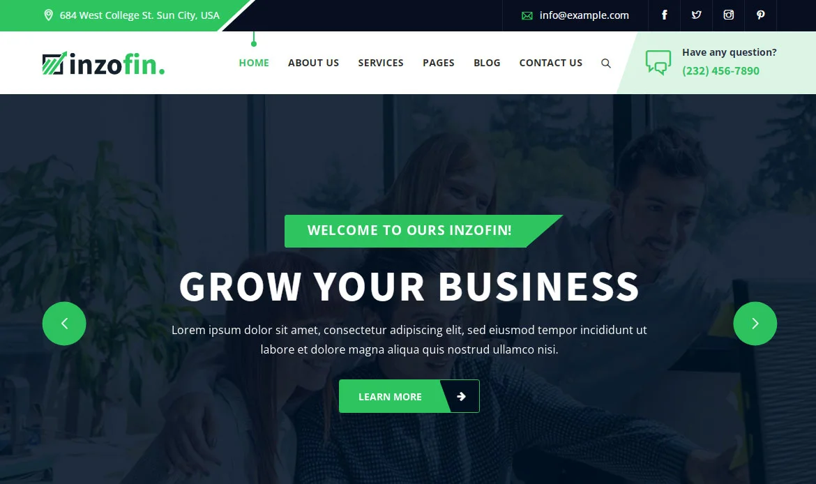
Inzofin Finance & Tax WordPress Theme is a powerful and mobile-friendly solution designed specifically for financial institutions, accounting firms, and tax professionals. With its sleek and responsive design, Inzofin ensures that your website looks stunning and functions seamlessly across all mobile devices.
Inzofin offers a comprehensive range of features and functionalities tailored specifically to the finance and tax industry. From showcasing financial services and expertise to providing online calculators and client portals, this interactive theme equips you with the tools necessary to establish a strong online presence, attract clients, and deliver seamless financial experiences within a mobile-friendly framework.
Key Highlights
- Finance and tax consulting theme
- Pre-designed pages for services and case studies
- Responsive design for mobile devices
- Compatible with popular plugins
- Optimized for SEO and speed
11. eGovenz
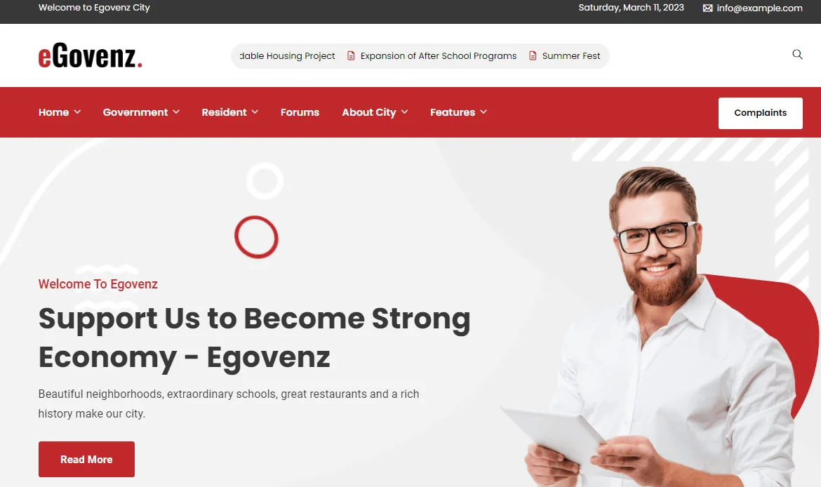
eGovenz City Government WordPress Theme is a robust and mobile-friendly solution designed to cater specifically to the needs of city governments, municipalities, and public sector organizations. With its sleek and responsive design, eGovenz ensures that your website looks impeccable and functions seamlessly across all mobile devices.
With eGovenz, you can create a strong online presence, engage with your citizens effectively, and deliver seamless experiences within a mobile-friendly framework. Experience the power of eGovenz and transform your city government’s digital presence into a catalyst for positive change. eGovenz offers a comprehensive range of features and functionalities tailored specifically to the unique requirements of city governments.
Key Highlights
- Designed for government and civic websites
- Responsive and user-friendly layouts
- Integration for public services and announcements
- Fast and lightweight code
- SEO optimized for better discoverability
12. Corpkit
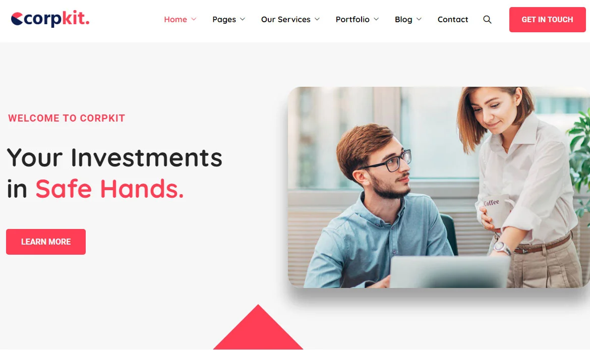
Corpkit Business Consulting WordPress Theme is a versatile and mobile-friendly solution designed to empower business consultants, advisory firms, and corporate professionals with a strong online presence. With its sleek and responsive design, Corpkit ensures that your website looks stunning and functions seamlessly across all mobile devices.
Corpkit offers a comprehensive range of features and customization options tailored specifically to the needs of business consultants and advisory firms. From showcasing your services and case studies to providing a seamless platform for clients to request consultations and submit inquiries, this theme equips you with the tools necessary to engage clients effectively, build credibility, and drive business growth.
Key Highlights
- Business consulting and corporate theme
- Pre-built demo layouts for quick setup
- Responsive and retina-ready design
- Supports Elementor and WPBakery builders
- SEO-friendly with fast loading speed
13. Vework
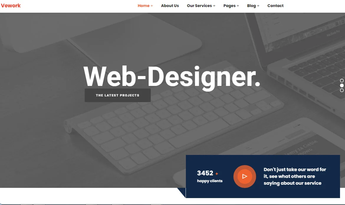
Vework Virtual Assistant WordPress Theme is a modern and mobile-friendly solution designed specifically for virtual assistants, freelancers, and remote professionals. With its sleek and responsive design, Vework ensures that your website looks stunning and functions seamlessly across all mobile devices.
Embrace the power of mobile responsiveness with Vework – the Virtual Assistant WordPress Theme that combines seo-friendly design, user-friendly features, and optimal performance across all mobile devices. With Vework, you can create a captivating online presence, showcase your skills, and deliver seamless experiences within a mobile-friendly framework.
Key Highlights
- Virtual assistant and business service theme
- Modern and responsive layout
- Customizable homepage and inner pages
- Integration with popular plugins
- SEO optimized for higher rankings
14. Pixzlo
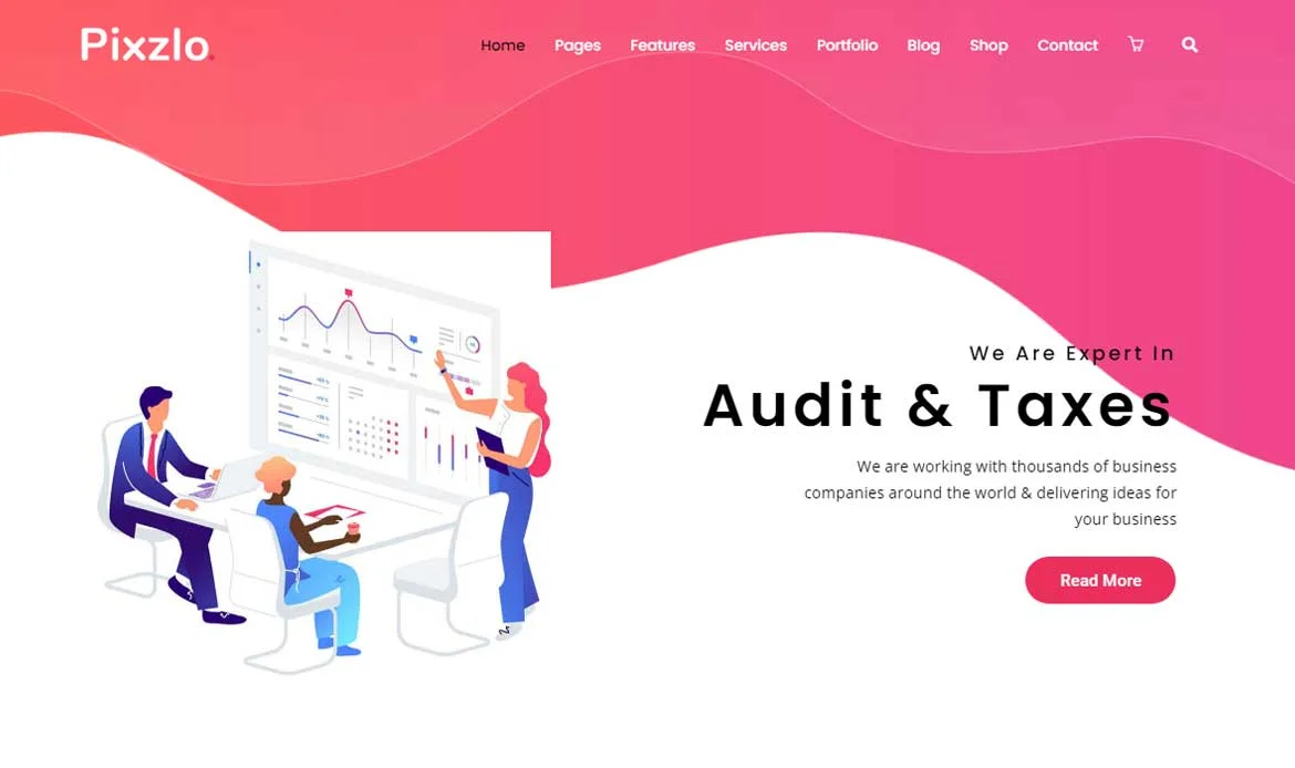
Pixzlo Creative Theme for Professionals is a cutting-edge and mobile-friendly solution designed to cater to the needs of creative individuals, agencies, and professionals across various industries. With its sleek and responsive design, Pixzlo ensures that your website looks stunning and functions seamlessly across all mobile devices.
Pixzlo’s mobile-friendly features go beyond visual appeal to prioritize usability and convenience. With its responsive design, your website automatically adjusts to different screen sizes and resolutions, ensuring optimal readability and intuitive navigation for mobile users.
Embrace the power of mobile responsiveness with Pixzlo – the Creative Theme for Professionals that combines sleek design, user-friendly features, and optimal performance across all mobile devices.
Key Highlights
- Creative portfolio and agency theme
- Fully responsive and retina-ready
- Easy customization options
- Supports Elementor and other page builders
- SEO-friendly and optimized for speed
15. GoSolar
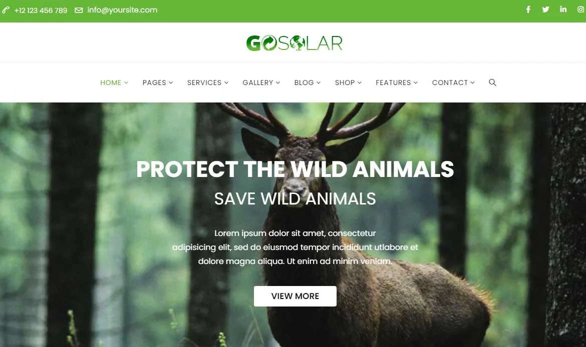
GoSolar Eco Environmental & Nature WordPress Theme is a modern and mobile-friendly solution designed to promote environmental causes, sustainability initiatives, and nature-focused organizations. With its sleek and responsive design, GoSolar ensures that your website looks stunning and functions seamlessly across all mobile devices
GoSolar offers a comprehensive range of features and customization options tailored specifically to the needs of eco-environmental organizations. From showcasing environmental projects and sharing educational resources to providing opportunities for visitors to get involved and make a positive impact, this simple theme equips you with the tools necessary to create a compelling online presence, inspire change, and drive meaningful engagement.
Key Highlights
- Solar energy and renewable power theme
- Responsive and mobile-optimized design
- Pre-built pages for services and projects
- Supports WooCommerce and plugins
- SEO-friendly and lightweight
16. Lendiz
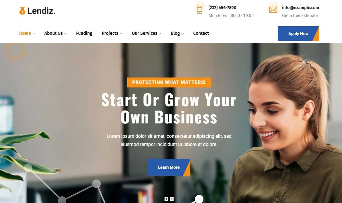
Lendiz Loan & Funding Agency WordPress Theme is a modern and mobile-friendly solution designed to empower loan providers, financial institutions, and funding agencies with a strong online presence. With its sleek and responsive design, Lendiz ensures that your website looks stunning and functions seamlessly across all mobile devices.
Mobile responsiveness is not just about adaptability; it also influences website performance. Lendiz is optimized for fast loading times, enabling quick access to loan calculators, application forms, and contact details. This enhances the user experience and encourages visitors to stay engaged with your website, ultimately increasing the chances of conversions and establishing trust in your loan services.
Key Highlights
- Loan and funding agency theme
- Modern, responsive layouts
- Integrated contact and application forms
- Supports Elementor and WPBakery
- Optimized for SEO and fast loading
17. Digion
Unleash the power of digital marketing with Digion he Online Digital Marketing WordPress Theme that brings your agency’s online presence to life. With its innovative and mobile-friendly design, Digion ensures that your website stands out and performs flawlessly across all mobile devices.
Mobile responsiveness isn’t just about aesthetics; it also influences website performance. Digion is optimized for lightning-fast loading times, ensuring that your digital marketing solutions, success stories, and contact information are readily available to visitors on their mobile devices. This enhances the user experience, captivates their attention, and increases the likelihood of conversions, ultimately helping you grow your client base and establish your agency as a leader in the digital marketing landscape.
Key Highlights
- Digital marketing and agency-focused theme
- Fully responsive and retina-ready
- Multiple demo options for quick setup
- Compatible with popular plugins
- SEO optimized for better visibility
18. Nutrie
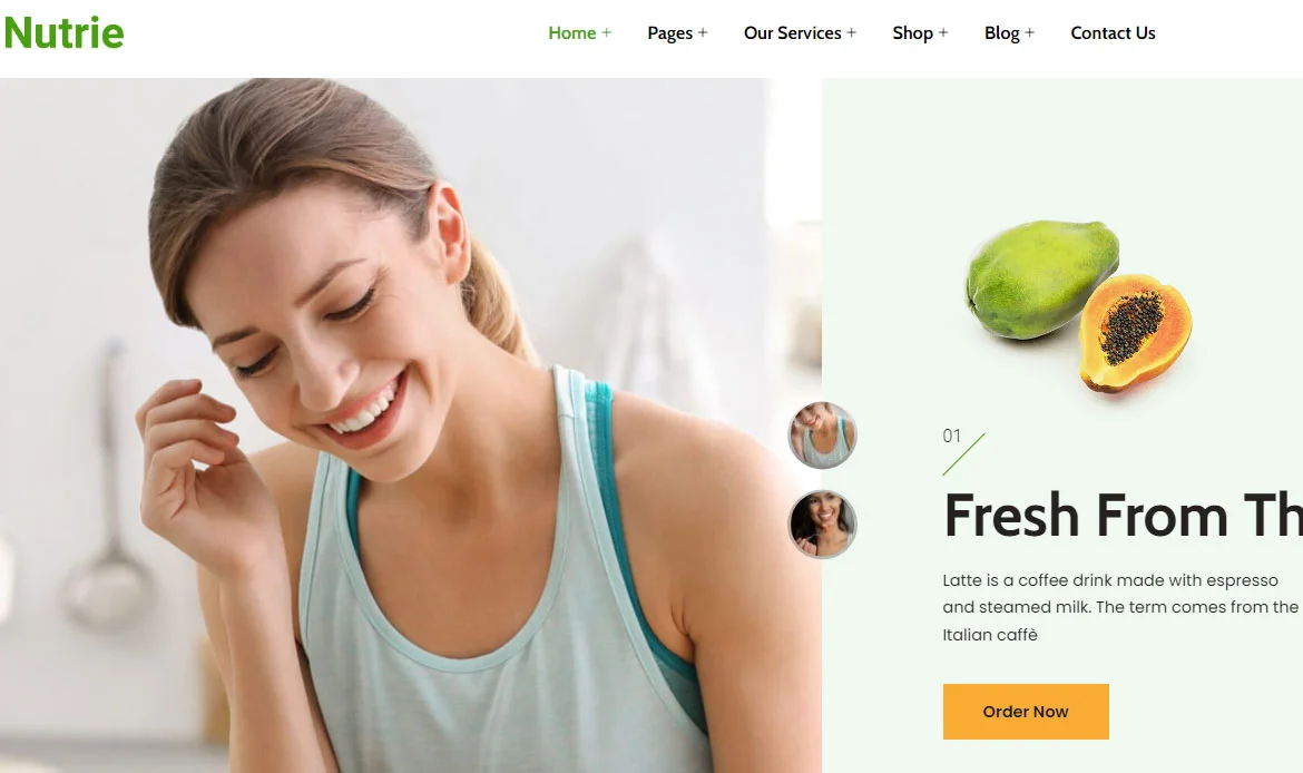
Embark on a transformative journey towards health and wellness with Nutrie the Health Coach and Nutrition WordPress Theme designed to revolutionize your online presence. With its captivating and mobile-friendly design, Nutrie ensures that your website not only looks stunning but also functions seamlessly across all mobile devices.
From showcasing your expertise and success stories to providing a seamless platform for clients to book appointments and access personalized resources, this unique theme equips you with the tools necessary to create a captivating online presence, inspire healthy living, and foster meaningful connections with your clients.
Key Highlights
- Health coach and nutrition-focused theme
- Responsive, modern design
- Customizable demo pages
- Supports booking and contact forms
- Optimized for SEO and performance
19. Lintis
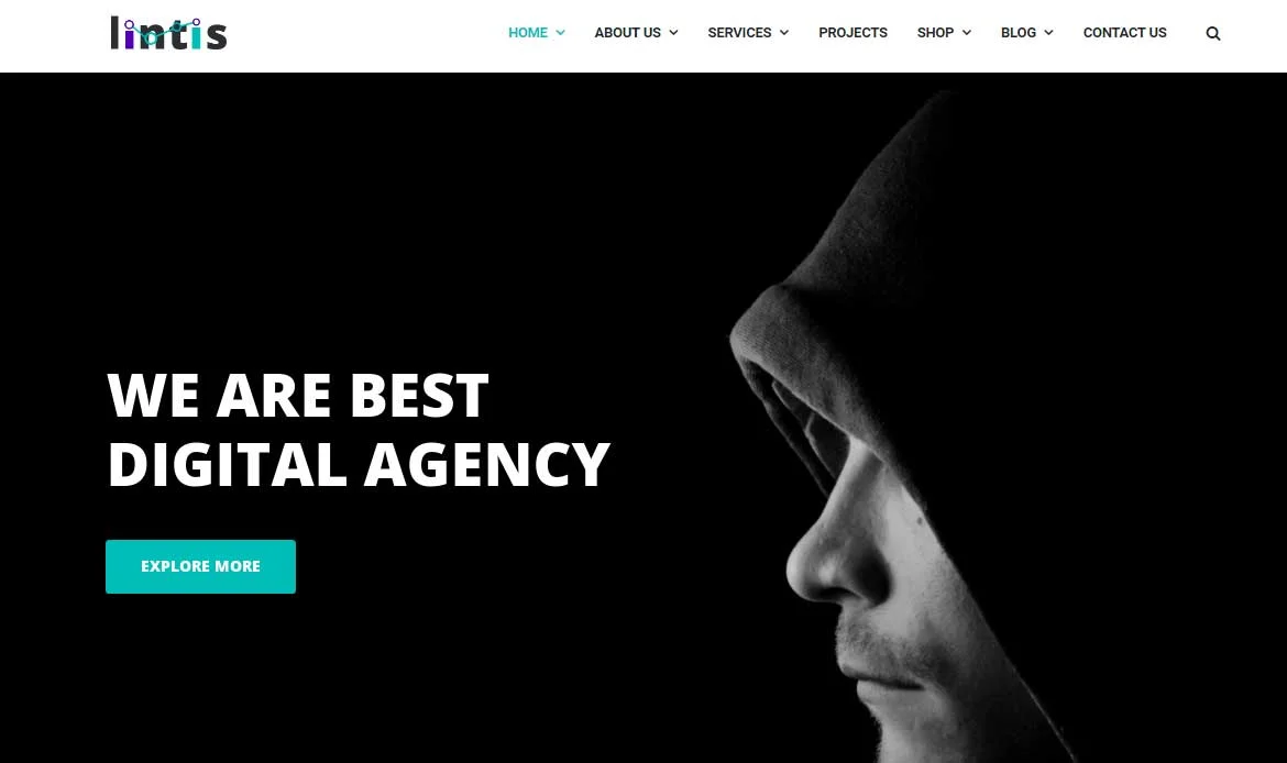
Embark on a digital journey to unlock online success with Lintis the SEO and Digital Agency WordPress Theme that takes your agency’s online presence to new heights. With its captivating and mobile-friendly design, Lintis ensures that your website not only looks stunning but also functions seamlessly across all mobile devices.
Embrace the mobile-friendly prowess of Lintis – the SEO and Digital Agency WordPress Theme that blends stunning design, user-centric features, and flawless performance across all mobile devices. With Lintis, you can elevate your agency’s online presence, fuel business growth, and unlock limitless possibilities in the dynamic world of digital marketing.
Key Highlights
- Corporate and agency WordPress theme
- Fully responsive layouts
- Multiple homepage options
- Integration with page builders
- SEO and speed optimized
20. Breno

Breno the Green Energy WordPress Theme that empowers your green energy business with a captivating and mobile-friendly online presence. With its interactive design and responsive layout, Breno ensures that your website shines on every screen, delivering an exceptional user experience across all mobile devices.
Breno goes beyond aesthetics to prioritize usability and convenience. Its responsive design automatically adjusts to different screen sizes and resolutions, ensuring optimal readability and intuitive browsing for mobile users. Whether clients are on the move, browsing your website on their smartphones, or exploring renewable energy options from the comfort of their tablets, Breno ensures they have an immersive and user-friendly experience.
Key Highlights
- Green energy and sustainable solutions theme
- Mobile-friendly and fully responsive
- Customizable demo pages for projects
- Supports WooCommerce and plugins
- SEO-optimized for high search rankings
Frequently Asked Questions About Choosing Mobile-Optimized WordPress Themes
What makes a WordPress theme truly mobile-friendly and responsive?
A mobile-friendly theme automatically adjusts its layout and design elements to fit any screen size, from smartphones to tablets and desktops. It ensures easy navigation, readable text, and smooth performance without requiring users to zoom or scroll horizontally.
How can mobile-optimized themes improve website performance and SEO?
Mobile-optimized themes load faster on smaller devices, reducing bounce rates and improving user engagement. Google also prioritizes mobile-friendly websites in search results, so using a responsive theme can significantly boost your SEO and online visibility.
Are these top themes compatible with popular plugins and page builders?
Yes, the best mobile-friendly WordPress themes are designed to integrate seamlessly with widely used plugins like WooCommerce, Elementor, WPForms, and others. This ensures full functionality while maintaining a responsive and smooth user experience across all devices.
Conclusion
As we conclude our exploration of the best 20 mobile-friendly themes of the year, it is clear that the demand for exceptional mobile experiences continues to grow. Your website’s ability to adapt and perform flawlessly on mobile devices is no longer a luxury but a necessity in today’s mobile-centric world.
We have carefully curated this list to provide you with a diverse range of themes that combine stunning design with optimal mobile responsiveness. Whether you’re running an e-commerce store, a blog, or a portfolio website, these themes offer the perfect blend of style and functionality to captivate your audience and keep them engaged.
Remember, a mobile-friendly website not only improves user experience but also positively impacts your search engine rankings. With these carefully selected themes, you can ensure that your website remains competitive and accessible across all devices.
Get Started Today with the Perfect Mobile-Optimized WordPress Theme for Your Site!
Discover the best 20 mobile-friendly WordPress themes of the year, crafted to deliver seamless browsing experiences across all devices. These themes are fully responsive, lightning-fast, and optimized for smartphones and tablets, ensuring your website looks perfect anywhere.