
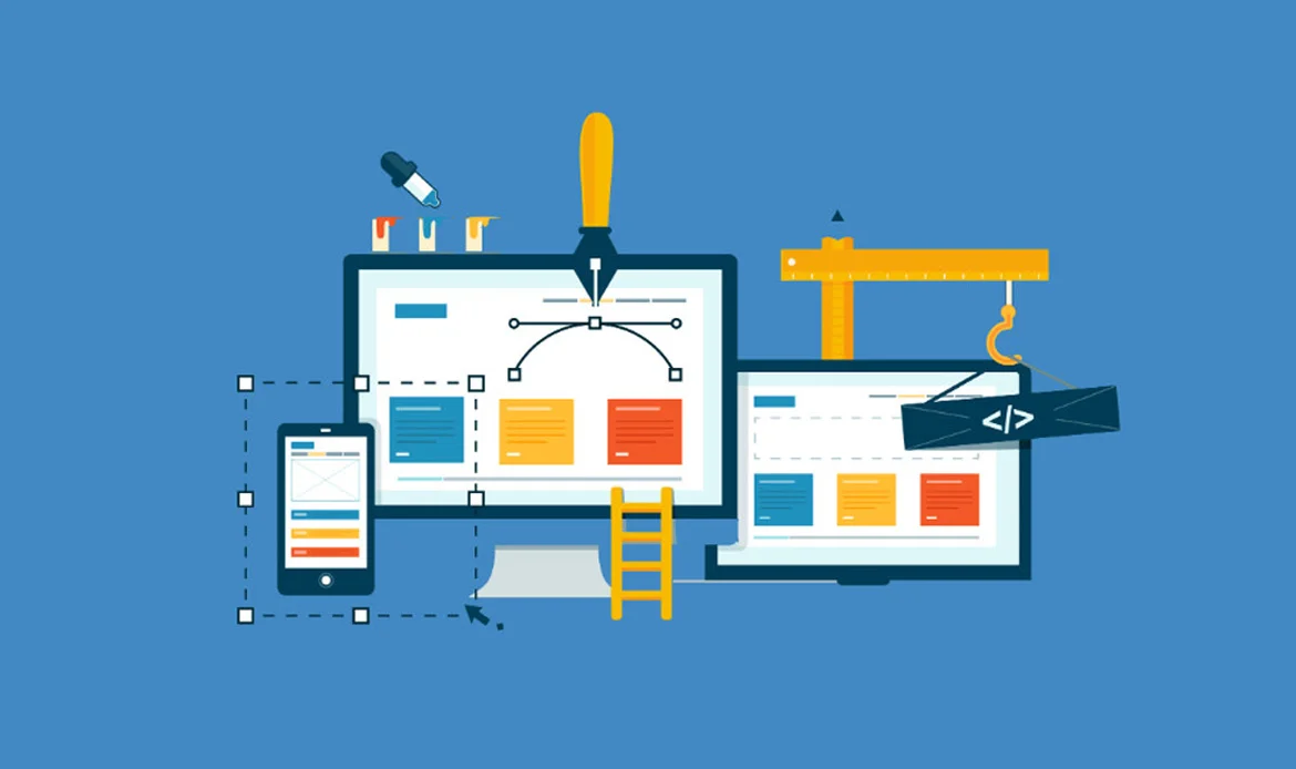
In the ever-evolving digital landscape, the heartbeat of online success lies in crafting websites that not only captivate but genuinely cater to the needs of every visitor. Welcome to “User-Friendly Websites 101: Key Principles and Implementation,” an insightful exploration into the art and science of web design. In this comprehensive guide, we delve into the fundamental principles that underpin user-friendly website design and provide practical strategies for their seamless implementation.
As we navigate the intricacies of modern web design, we’ll uncover the essential principles that transform a website into an intuitive, accessible, and delightful space for users.Mastering User-Friendly Websites: Core Principles & Practical Steps
Introduction to User-Friendly Design
 The concept of user-friendliness goes beyond the surface, transcending aesthetics to encompass accessibility, navigation, and overall user satisfaction. At its core, a user-friendly website is an intuitive and seamless digital environment that caters to the diverse needs and expectations of its visitors.
Key Principles of User-Friendly Web Design
1. Simplified Navigation:
The primary aim is to ensure that visitors can effortlessly move around the site, locate information, and interact with the content. This involves the implementation of several key elements:
Clear and Logically Organized Navigation Menus: The menus on the website should be structured in a way that is easy to understand. This may involve categorizing information logically and arranging menu items in a hierarchical order, providing users with a clear roadmap to explore the site—an essential practice in designing User-Friendly Websites.
Example:
The example illustrates a website that effectively implements simplified navigation:
Straightforward Menu Structure: The website features a main menu with clearly labeled categories, such as “Men,” “Women,” “Kids,” and “Accessories.”
Intuitive Subcategories: Hovering over each main category reveals subcategories, providing additional refinement. For instance, under “Women,” users may find options like “Shoes,” “Clothing,” and “Bags.”
Breadcrumb Trail: Each product page includes a breadcrumb trail (e.g., Home > Women > Clothing > Dresses), allowing users to understand their current location within the site and easily backtrack.
Clear and Familiar Language: The language used in the menu items is clear and avoids industry-specific jargon, ensuring that users can quickly grasp the website’s structure.
2. Engaging Visual Design:
Visual design is a key element in web design that focuses on creating a positive and impactful first impression on users. This principle emphasizes the importance of striking a balance between aesthetics and functionality. It suggests that designers should not only focus on making a website visually appealing but also ensure that the design enhances the overall user experience.
The term “visually cohesive design language” refers to the idea that all visual elements on the website should work together harmoniously. This includes maintaining consistency in color schemes, typography, imagery, and other design elements throughout the website. A cohesive design language contributes to a unified and professional appearance.
The example illustrates what a website with engaging visual design might look like:
Visually Appealing Layout: The website features a layout that is aesthetically pleasing and visually balanced. This may involve a clean and organized arrangement of content, ensuring that users are not overwhelmed by clutter.
Well-Chosen Color Schemes: The color palette used in the design is carefully selected and consistent across the website. Colors evoke a certain mood or atmosphere and contribute to the overall branding.
High-Quality Images or Videos: The website incorporates high-resolution images or videos that are relevant to the content. These multimedia elements not only add visual interest but also serve a purpose, such as showcasing products or conveying information in a more engaging way.
3. Prioritizing Accessibility:

“Prioritizing Accessibility” is a fundamental principle in web design that underscores the importance of making websites inclusive and accessible to individuals with disabilities. User-friendly design should cater to the diverse needs of all users, regardless of their abilities.
The explanation highlights specific practices that contribute to accessibility:
Example:
The example illustrates what a website that prioritizes accessibility might look like:
Follows Accessibility Guidelines: The website adheres to recognized accessibility guidelines, such as the Web Content Accessibility Guidelines (WCAG). These guidelines provide a comprehensive set of recommendations for making web content more accessible to all users, which is a core element of building User-Friendly Websites.
Navigable for Users with Visual Impairments: Users with visual impairments, using screen readers, can easily navigate through the website. This includes clear and concise descriptions for images, well-structured headings, and other features that enhance the overall accessibility of the site.
Consideration for Various Disabilities: The design takes into account various disabilities, ensuring that the website is usable for individuals with diverse needs. This may involve providing keyboard shortcuts, ensuring sufficient color contrast, and offering alternatives for interactive elements.
In essence, the example envisions a website that embraces accessibility principles, making it more welcoming and usable for a broad spectrum of users, including those with visual impairments or other disabilities. Prioritizing accessibility not only aligns with ethical considerations but also enhances the overall user experience for everyone.
4. Responsive Design for All Devices:
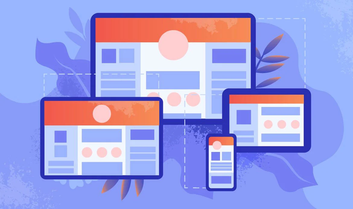
“Responsive Design for All Devices” is a crucial principle in web design that acknowledges the diverse array of devices people use to access websites. The core idea is to ensure that a website is designed and developed to be responsive, meaning it adapts seamlessly to various screen sizes and resolutions. This responsiveness is essential for providing users with a consistent and enjoyable experience, regardless of the device they are using.
Key points in the explanation include:
Variety of Devices: Users access websites using different devices, such as desktop computers, laptops, tablets, and smartphones. Each of these devices has varying screen sizes and resolutions.
Consistent User Experience: User-friendly design aims to provide a consistent and enjoyable user experience across all devices. Regardless of whether a user visits the website on a large desktop monitor or a small smartphone screen, the design should adapt to offer a seamless and visually appealing experience.
Example:
The example illustrates what a website with responsive design might look like:
Adaptation to Different Screen Sizes: The website is designed to look and function well on a spectrum of devices, including desktops, laptops, tablets, and smartphones.
Dynamic Content and Layout Adjustment: As a user switches from a desktop view to a mobile view, or from a landscape-oriented tablet to a portrait-oriented one, the content and layout of the website adjust dynamically. This ensures that the user interface remains user-friendly, with readable text, well-organized content, and optimized navigation for each device.
Optimal User Experience on All Devices: Users experience a seamless transition between devices, with the website providing an optimal viewing and interaction experience tailored to the specific characteristics of each device.
5. Loading Speed Optimization:
In the digital age, users expect fast-loading websites, and optimizing loading speed is crucial for providing a positive user experience. The explanation mentions several strategies that contribute to achieving optimal loading times:
Compressing Images: Large and uncompressed images can significantly slow down a website’s loading time. Compressing images reduces their file size without compromising quality, allowing pages to load faster.
Minimizing HTTP Requests: Each element on a webpage, such as images, stylesheets, and scripts, requires a separate HTTP request. Minimizing these requests by combining files or using efficient coding practices reduces the time it takes for a webpage to load.
Employing Content Delivery Networks (CDNs): CDNs are networks of servers distributed globally. By storing static website content on servers closer to the user, CDNs reduce the physical distance data needs to travel, resulting in faster loading times.
Example:
The example illustrates what a website with optimized loading speed might look like:
Swift Loading Times: The website loads swiftly, with minimal waiting times for users. Pages appear almost instantaneously, contributing to a seamless and responsive browsing experience.
Efficient Handling of Media: Images and multimedia elements are optimized for the web, striking a balance between quality and file size. This ensures that users don’t experience delays due to large media files.
Streamlined Code and Resource Delivery: The website’s code is well-organized and optimized, minimizing unnecessary elements and reducing the number of HTTP requests. This efficiency in code and resource delivery contributes to faster loading speeds.
By adhering to these key principles, web designers can create websites that are not only visually appealing but also user-friendly, accessible, and optimized for a seamless experience across different devices and platforms.
Implementation Strategies
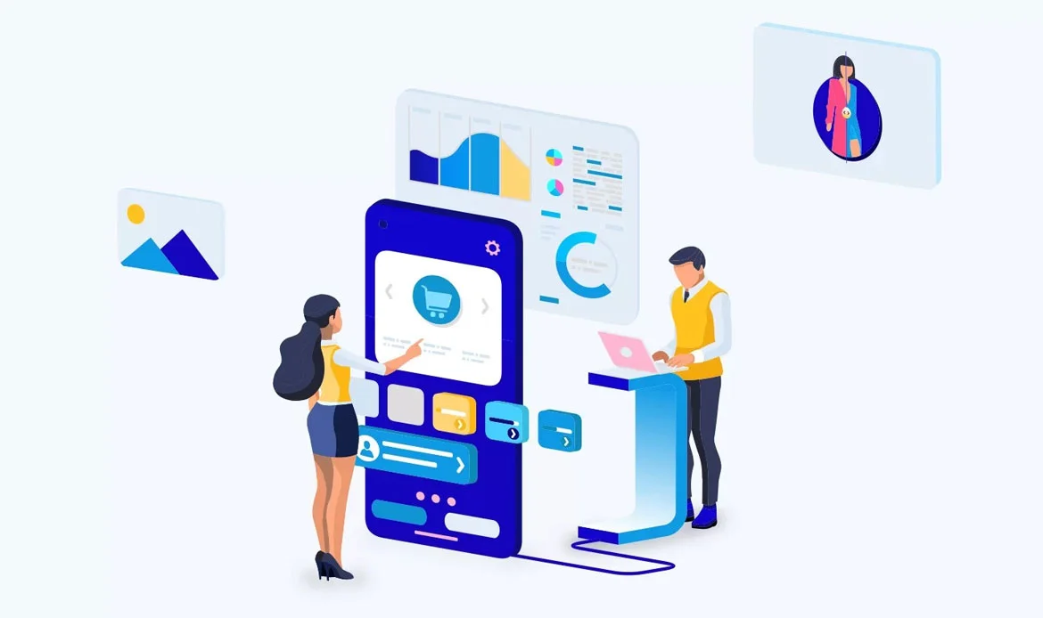
1. User-Centric Content Organization:

“User-Centric Content Organization” is a strategy in web design that revolves around arranging and presenting website content with a primary focus on enhancing the user’s experience. The key aspects highlighted in the explanation include:
Understanding the User’s Journey: This strategy begins with gaining insights into how users navigate and interact with the website. By understanding the user’s journey, designers can tailor the organization of content to meet the expectations and needs of the audience.
Logical Content Grouping: The content on the website is logically grouped based on thematic relevance or user intent. This ensures that related information is clustered together, making it easier for users to find what they are looking for without unnecessary confusion.
Effective Use of Calls-to-Action (CTAs): CTAs are strategically placed throughout the website to guide users to take desired actions. Whether it’s encouraging users to make a purchase, sign up for a newsletter, or explore more content, CTAs play a crucial role in steering the user through the website’s intended journey.
Creating a Seamless Flow of Information: The overall structure of the website is designed to facilitate a seamless flow of information. Users can navigate from one section to another intuitively, creating a cohesive and engaging experience. This involves clear pathways and connections between different pieces of content.
Example:
The example illustrates what a website with user-centric content organization might look like:
Clear Categories: The website features distinct and well-defined categories, making it easy for users to identify the areas of interest. For instance, an e-commerce website might have categories like “Men’s Apparel,” “Women’s Accessories,” etc.
Intuitive Navigation: The navigation system is user-friendly and intuitive, allowing visitors to easily move between different sections. Logical menu structures and easily understandable labels contribute to a smooth navigation experience.
Strategically Placed CTAs: Throughout the website, strategically placed CTAs guide users through the desired actions. For instance, on a product page, a CTA might prompt users to “Add to Cart,” and on a blog page, it could encourage them to “Read More.”
Logical Flow of Information: The content is organized in a way that follows a logical flow, mirroring how users naturally seek information. For example, a blog may present content in a chronological order or categorize articles by topic.
2. Feedback and Iteration:
Feedback and Iteration underscore the dynamic and continuous nature of user-friendly design. The key points in the explanation include:
Ongoing, Iterative Process: User-friendly design is not a one-time task but an ongoing and iterative process. It acknowledges that user needs, preferences, and technology evolve over time. Designers should be prepared to revisit and refine aspects of the website continually, ensuring it aligns with the principles of User-Friendly Websites.
Conducting Usability Testing: Usability testing involves observing how users interact with the website in real-world scenarios. This hands-on approach can reveal user frustrations, preferences, and stumbling blocks, offering invaluable insights into the actual user experience.
Continuous Improvement: Understanding user behavior through feedback and analytics allows for continuous improvement. By identifying pain points and addressing user concerns, the website can evolve to better meet user preferences and remain responsive to changing needs.
Example:
Surveys: Regularly distributing surveys to website visitors to gather qualitative feedback on their experiences. Questions could cover ease of navigation, satisfaction with content, and suggestions for improvement.
Analytics: Analyzing website analytics to track user behavior, including which pages are most visited, how long users stay on the site, and where they drop off. This data helps identify popular content and areas that may need improvement.
Usability Testing: Conducting usability testing sessions with actual users helps identify how they interact with the website. This could involve tasks such as finding specific information, completing forms, or navigating through different sections. Such testing is an essential step in building User-Friendly Websites, as it ensures the design truly meets visitor needs.
Iterative Changes: Based on the insights gained from user feedback and testing, making iterative changes to the website. This could involve adjusting the layout, refining navigation elements, or optimizing content to enhance the overall user experience.
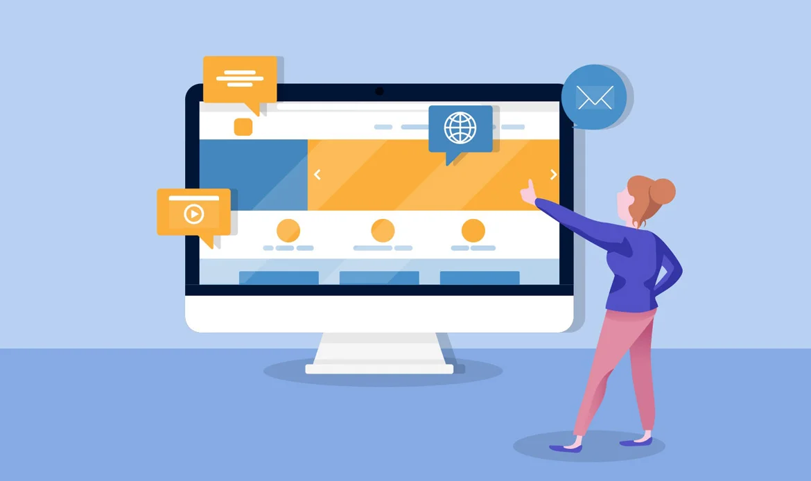
3. Interactive Elements for Engagement:
It highlights the importance of creating a dynamic and enjoyable user experience through interactive features. Key points in the explanation include:
Engagement as a Priority: The explanation emphasizes that engagement is a crucial aspect of user-friendly design. Keeping users actively involved and interested in the website goes beyond providing static content. Interactive elements are introduced to make the user experience more dynamic and enjoyable.
Incorporating Interactive Elements: The strategy suggests incorporating various interactive elements such as sliders, animations, and micro-interactions. These elements serve to capture and retain user attention, providing a more immersive and engaging experience compared to static content.
Dynamic User Experience: By incorporating interactive elements, designers aim to go beyond traditional, static web pages. Users are encouraged to participate actively, whether it’s through scrolling through image sliders, experiencing animated transitions, or engaging with small but delightful micro-interactions.
Example:
The example illustrates what a website with interactive elements might look like:
Image Sliders: The website features interactive image sliders on the homepage or relevant sections. Users can navigate through a series of images or content by clicking, dragging, or using navigation arrows.
Animated Transitions: When transitioning between pages or sections, the website incorporates smooth and visually appealing animations. These animations add a layer of sophistication to the user experience, making the navigation process more enjoyable.
Micro-Interactions: Throughout the website, there are subtle micro-interactions that respond to user actions. For instance, buttons changing color when hovered over, confirmation messages appearing with a subtle animation, or interactive icons that respond to user clicks. These small yet impactful details play a crucial role in creating User-Friendly Websites, enhancing both usability and overall engagement.
4. Strategic Social Media Integration:
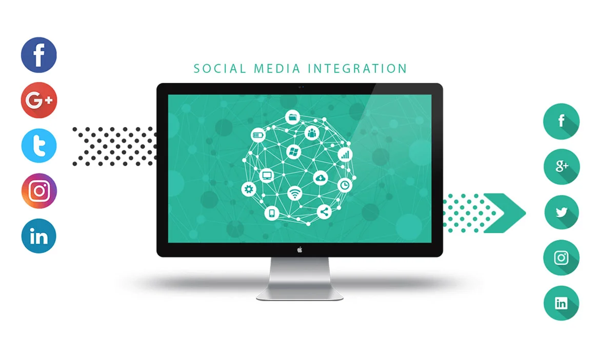
“Strategic Social Media Integration” is a web design strategy that recognizes the widespread impact of social media and aims to leverage it to enhance user engagement on a website. Key points in the explanation include:
Pervasive Influence of Social Media: Acknowledges the ubiquitous role of social media in people’s lives. Social platforms provide a space for users to connect, share, and engage with content.
Integrating Social Platforms Strategically: The strategy involves thoughtful integration of social media platforms into the website. Rather than a mere presence, this integration is strategic, designed to complement the overall user experience.
Enhancing User Engagement: The primary goal is to boost user engagement. By integrating social media elements seamlessly, users can easily connect with the website’s content, share it with their social networks, and participate in a broader online community.
Best Practices: The explanation mentions best practices, such as incorporating social sharing buttons. These buttons allow users to share specific content directly to their social media profiles. Additionally, embedding live social media feeds and encouraging user-generated content are highlighted as effective strategies to foster a sense of community around the website.
Example:
The example illustrates what a website with strategic social media integration might look like:
Social Sharing Buttons: Each article or piece of content on the website features prominent social sharing buttons. Users can click these buttons to share the content on platforms like Facebook, Twitter, or Instagram, extending the reach of the website’s content.
Live Social Media Feeds: The website incorporates live feeds from its official social media accounts. Users can see the latest posts, updates, or tweets directly on the website, creating a dynamic and real-time connection between the website and its social media presence.
Encouraging User-Generated Content: The website actively encourages users to contribute their content, such as comments, reviews, or even multimedia submissions. This user-generated content fosters a sense of community and interaction among website visitors.
5. User-Focused Technical Optimization:
Technical optimization is essential for ensuring a website’s seamless functionality. This strategy explores various technical optimization approaches, such as optimizing for voice search, implementing dark mode options for user preference, and considering environmental sustainability in web development practices.
Example: A website that not only meets technical standards for performance but also considers emerging trends like voice search, offers dark mode options for users, and incorporates sustainable practices in its technical infrastructure.
By implementing these strategies, web designers can create websites that not only look good but also prioritize user experience, engagement, and adaptability to evolving user preferences and technological advancements.
FAQ – User-Friendly Websites 101: Key Principles and Implementation
1. What makes a website user-friendly?
A user-friendly website is easy to navigate, visually clear, loads quickly, and provides a seamless experience across all devices. It focuses on the needs of the visitor and ensures accessibility for everyone.
2. Why is implementing user-friendly principles important?
User-friendly principles help reduce bounce rates, improve customer satisfaction, and boost conversions. A smooth browsing experience encourages visitors to stay longer and engage more with your content.
3. How can I start improving my website’s usability?
Begin by simplifying navigation, optimizing load speed, using responsive design, and ensuring content is clear and accessible. Testing your site with real users can also uncover areas for improvement.
Final Thoughts
As we conclude our exploration into “User-Friendly Websites 101: Key Principles and Implementation,” we find ourselves at the intersection of design mastery and user satisfaction. Throughout this journey, we’ve uncovered the fundamental principles that transform websites into welcoming, accessible, and intuitive spaces for every visitor.