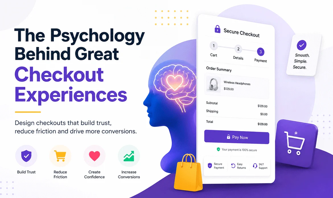
Checkout experience is the deciding factor between a completed purchase and an abandoned cart. You can invest thousands in ads, create stunning product pages, and attract highly qualified visitors, but if the final buying journey feels confusing or untrustworthy, customers can leave within seconds. That’s why the checkout stage isn’t just a payment process it’s the moment where trust, confidence, and user psychology determine whether a visitor becomes a paying customer.
Think about the last time you shopped online. You found the perfect product, added it to your cart, and were ready to buy. Then you encountered an unexpected shipping fee, a lengthy registration form, or a payment page that didn’t feel secure. Suddenly, your excitement faded, and you decided to “buy it later.” This behavior is incredibly common and happens to millions of online shoppers every day.
The truth is, customers rarely abandon their carts because they no longer want the product. More often, they leave because something during the purchasing journey creates doubt, increases mental effort, or breaks their confidence. Even small obstacles like asking for unnecessary information, hiding delivery costs until the last step, or offering a cluttered payment page can interrupt the buying decision and cost businesses valuable sales.
1. The Behavioral Psychology of Successful Checkouts
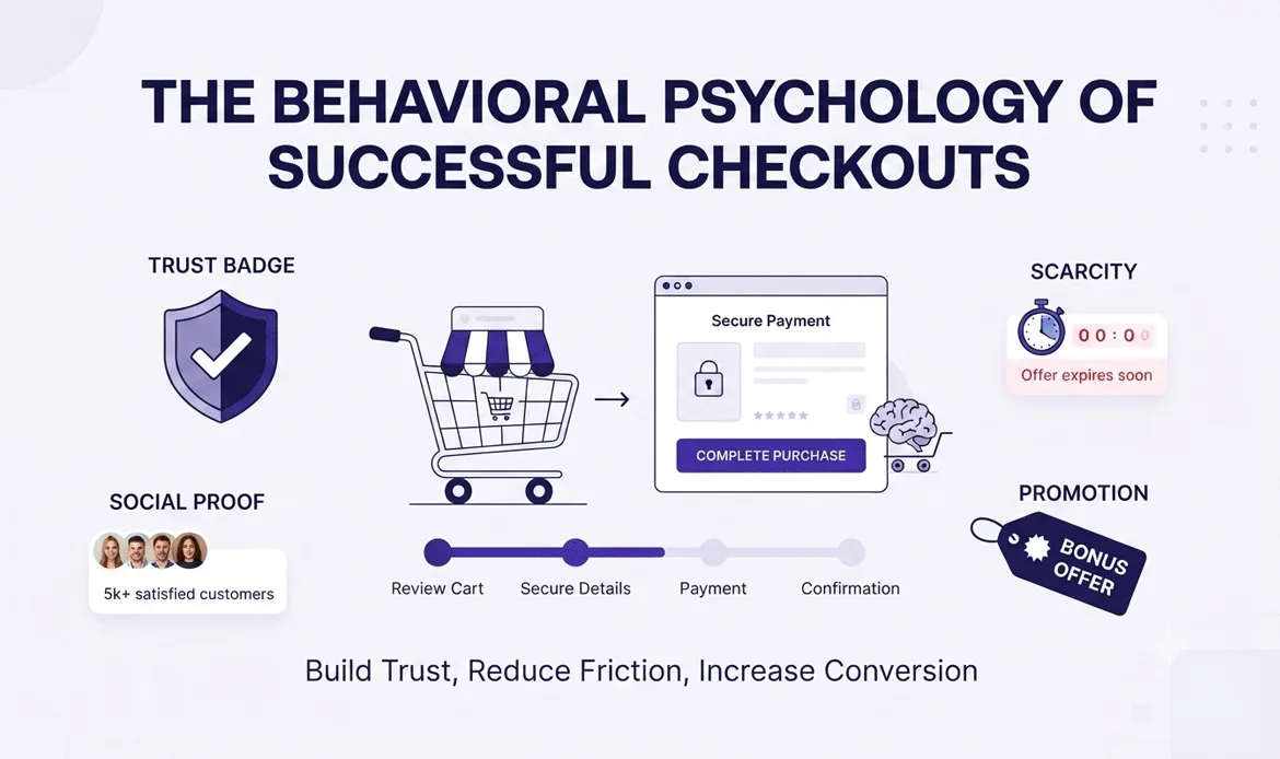
Most ecommerce businesses assume customers abandon their carts because the product is too expensive. While pricing can certainly influence buying decisions, it is rarely the only reason.
Think about your own shopping habits. You’ve probably decided to buy something online, only to hesitate after reaching the payment page. Nothing changed about the product itself—yet something changed in the way you felt.
That moment of hesitation is where psychology becomes more important than technology.
A great Checkout experience isn’t simply about collecting payment details. It’s about removing doubt, building confidence, and making every step feel effortless. When customers feel comfortable, they’re far more likely to complete their purchase without second-guessing themselves.
The good news is that these psychological principles aren’t limited to global brands. Whether you’re running a WooCommerce store, a Shopify business, or a custom ecommerce website, understanding how people make decisions can help you create a smoother buying journey that encourages more completed purchases.
2. Why Customers Leave at the Last Minute (It’s Not Always About Price)
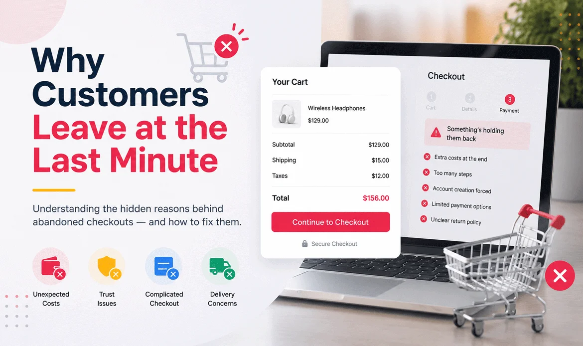
One of the biggest misconceptions in ecommerce is believing that customers abandon their carts because they suddenly decide the product is too expensive.
In reality, many shoppers have already convinced themselves to buy before they reach the payment page.
So, what changes?
Their confidence.
Imagine you’re shopping for a premium wireless headset. You’ve compared reviews, watched YouTube videos, and finally found the perfect model. You add it to your cart, excited to complete the purchase. This is where checkout conversion optimization becomes critical ensuring the checkout process is fast, seamless, and friction-free so nothing stands between your excitement and a successful purchase.
Then you click Checkout.
Instead of seeing a simple payment page, you’re greeted with:
- Create an account
- Verify your email
- Fill out fifteen form fields
- Choose from six shipping options
- Enter a coupon code
- Accept multiple terms and conditions
Just a few seconds ago, buying felt exciting.
Now it feels like work.
This is exactly where businesses lose customers not because the product became less valuable, but because the buying process introduced unnecessary friction.
A thoughtfully designed Checkout user experience removes these obstacles before they become reasons to leave. Every unnecessary click, form field, or decision adds mental effort, making it easier for customers to postpone their purchase.
⮞ Real-World Example: Amazon
Amazon didn’t become the world’s largest ecommerce platform by accident.
One of its biggest innovations was simplifying the buying process through features like saved addresses, stored payment methods, and One-Click purchasing.
The goal wasn’t to make customers buy faster it was to eliminate unnecessary interruptions.
Instead of asking users to repeat the same information every time they shop, Amazon remembers their preferences, allowing them to complete purchases in seconds.
The lesson for every online store is clear:
The easier you make it for customers to finish buying, the fewer opportunities they have to change their minds.
3. The Psychology Behind Every Purchase Decision
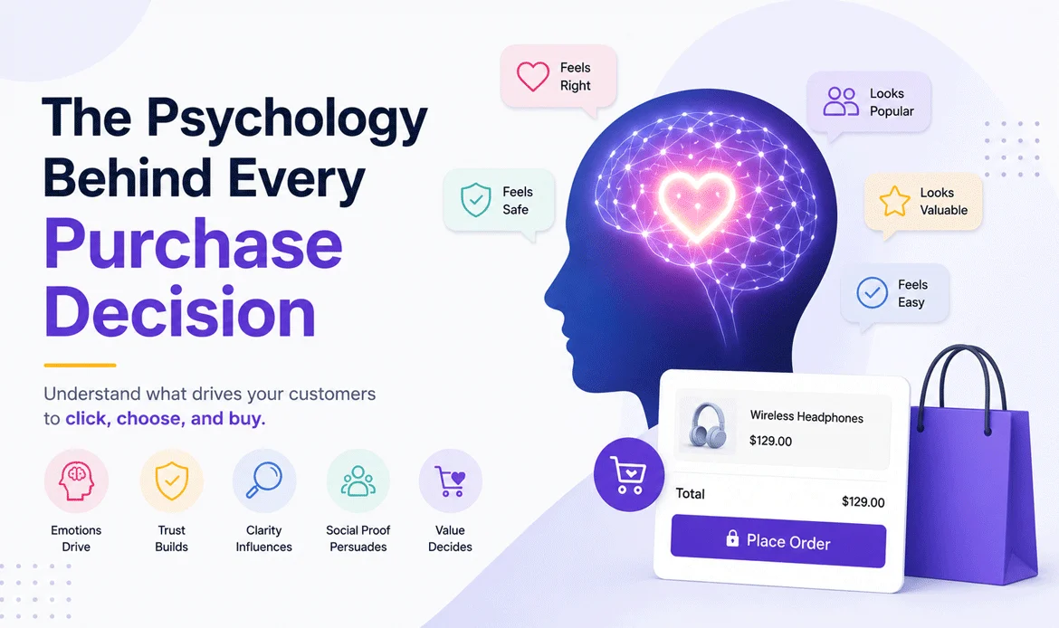
People like to believe they make rational buying decisions.
In reality, emotions almost always make the first decision, while logic simply provides the justification afterward.
Think about purchasing a new smartphone.
Most buyers don’t choose a device solely because of technical seo specifications. They imagine taking better photos, enjoying smoother performance, or feeling excited about owning the latest model.
That emotional connection happens long before payment.
During the final purchase stage, customers silently ask themselves questions like:
- Is this website trustworthy?
- Will my payment be secure?
- What happens if I need a refund?
- Am I making the right choice?
- Can I trust this brand?
Every unanswered question creates uncertainty.
This is why a successful Checkout conversion optimization strategy isn’t just about faster pages or cleaner layouts. It’s about reducing doubt and reinforcing confidence at every step.
⮞ Three Psychological Triggers That Influence Every Purchase
1. Loss Aversion
People naturally fear making a bad decision more than they enjoy making a good one.
A shopper who has already imagined owning your product becomes extremely cautious if something feels suspicious during payment.
Even a small concern such as unclear shipping information or missing trust badges can outweigh the excitement of buying.
2. Cognitive Load
The human brain has limited attention.
Every extra form field…
Every popup…
Every coupon box…
Every unnecessary question…
requires additional mental effort.
Eventually, customers become mentally exhausted and postpone their decision.
That’s why simpler checkout flows consistently outperform complicated ones.
3. Trust Signals
Before entering credit card details, customers instinctively look for reassurance.
Small elements such as:
- Secure HTTPS connection
- Verified payment methods
- Customer reviews
- Money-back guarantees
- Clear return policies
Checkout conversion optimization goes beyond reducing friction it also helps send powerful subconscious signals that the business is safe, trustworthy, and reliable. From secure payment badges and transparent policies to a clean, professional checkout design, these trust-building elements reassure customers and increase their confidence to complete the purchase.
This is exactly why businesses invest heavily in Checkout conversion optimization because trust often matters more than persuasion.
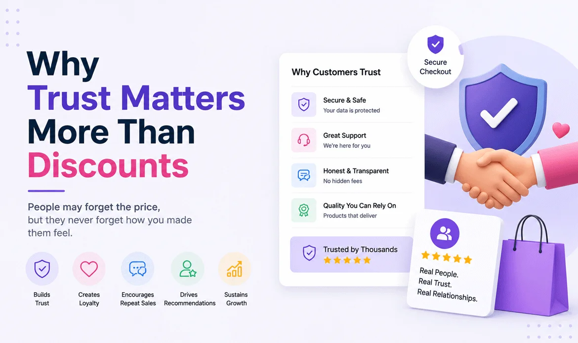
4. Why Trust Matters More Than Discounts
Imagine you’re shopping for the same pair of running shoes on two different websites.
The first store offers a 20% discount, but it has no customer reviews, no visible contact information, and the payment page looks outdated.
The second store sells the shoes at full price, displays thousands of positive reviews, trusted payment methods, a clear return policy, and secure checkout badges.
Which one would you trust with your credit card?
For most people, the answer is obvious.
People don’t just buy products they buy confidence. If something feels risky, even the biggest discount won’t always convince them to complete the purchase.
A reliable Checkout experience reassures customers that every step is safe, transparent, and worth their trust. Confidence often becomes the deciding factor between a completed purchase and an abandoned cart.
- Trust Signals Every Ecommerce Store Should Display
- SSL (HTTPS) security certificate
- Trusted payment gateways
- Customer reviews and ratings
- Money-back guarantee
- Clear shipping information
- Transparent return and refund policy
- Contact details
- Estimated delivery dates
⮞ Real Example – Apple
Apple rarely competes on price.
Instead, it builds trust through consistency.
From the product page to the payment screen, every element feels polished, predictable, and professional website.
Customers don’t waste time wondering whether Apple is trustworthy they already believe it is.
That confidence is one of Apple’s biggest competitive advantages.
Takeaway
Customers pay for certainty before they pay for products.
5. Why Simplicity Sells: Understanding Hick’s Law
Have you ever opened a restaurant menu with hundreds of dishes and struggled to decide what to order?
The same thing happens online.
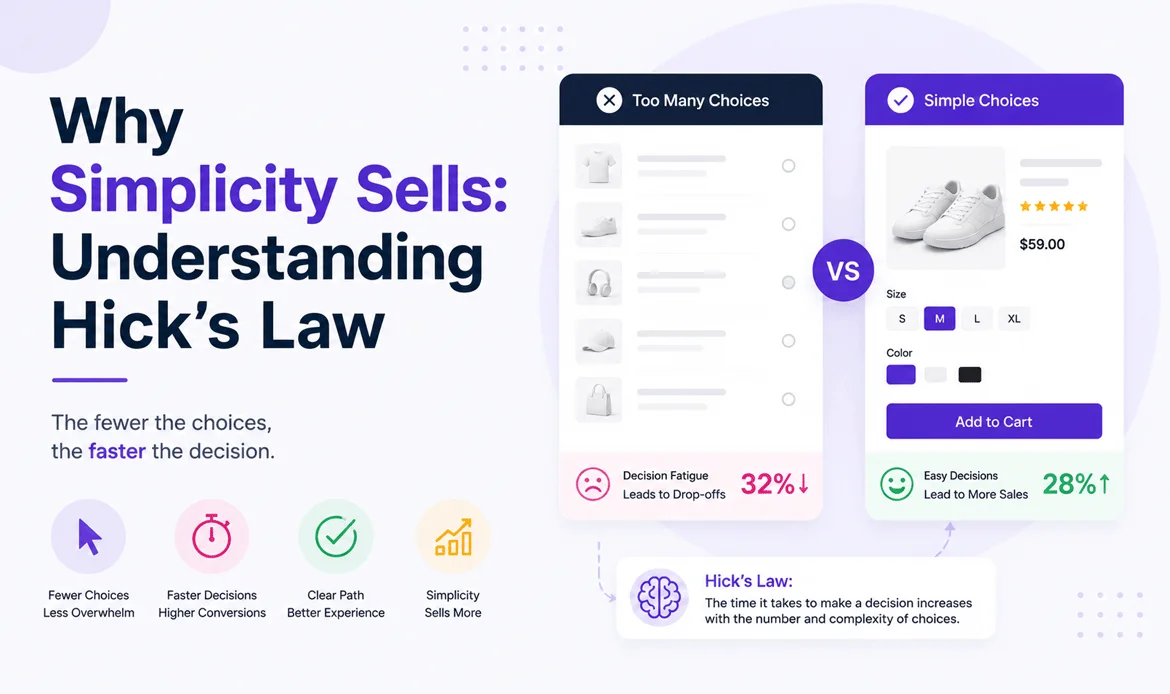
The more choices customers face, the longer they take to decide.
This psychological principle is called Hick’s Law, which states that increasing the number of choices increases the time required to make a decision.
During checkout, too many options create unnecessary friction.
Examples include:
- Multiple shipping methods with confusing names
- Too many payment gateways
- Several coupon fields
- Extra upsells before payment
- Optional add-ons everywhere
Instead of helping customers, these choices often delay their decision.
A carefully designed Checkout experience focuses on clarity rather than quantity, making the path to purchase feel straightforward and stress free.
⮞ Real Example – Netflix
When Netflix asks users to subscribe, the process is remarkably simple.
Choose a plan.
Create an account.
Enter payment details.
Start watching.
There are no distracting offers or complicated navigation.
Every screen has one purpose.
That same principle works exceptionally well in ecommerce.
6. The Zeigarnik Effect: Why Progress Bars Increase Conversions
Have you ever noticed how satisfying it feels to complete a task?
Whether it’s finishing a workout, completing a puzzle, or ticking items off a checklist, our brains naturally want closure.
Psychologists call this the Zeigarnik Effect.
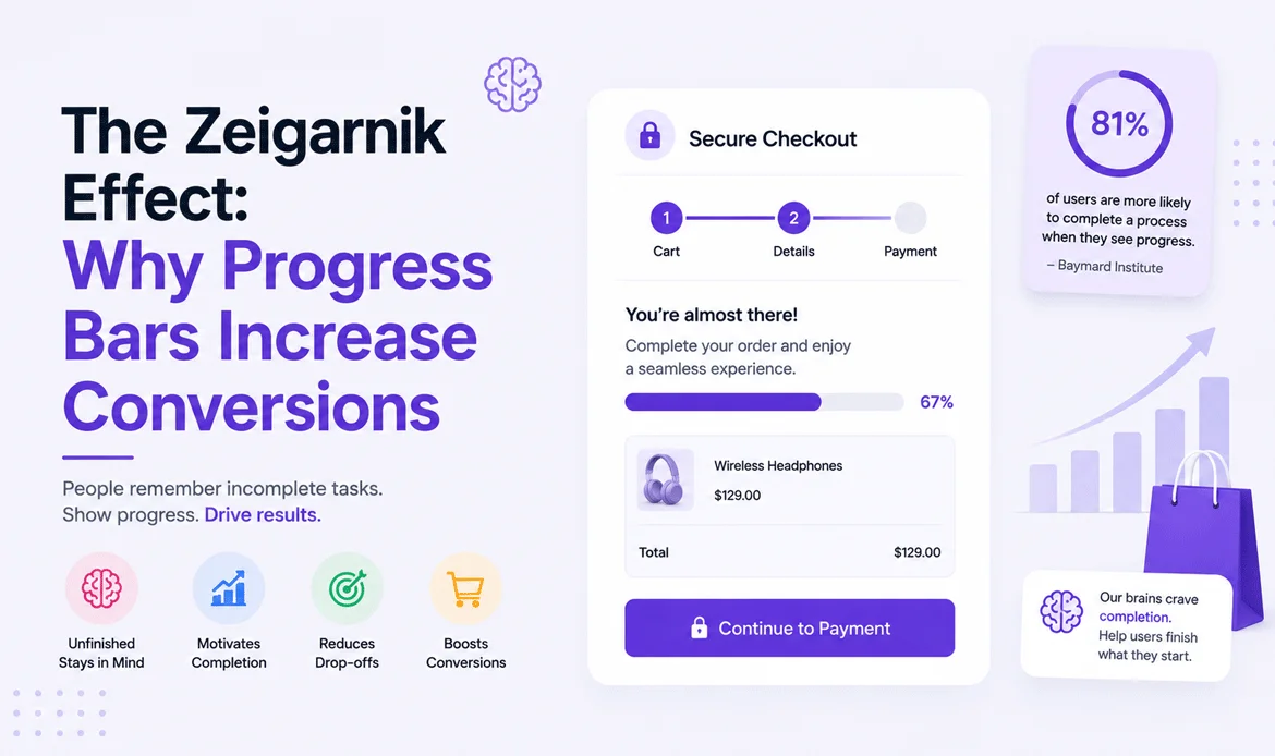
People remember unfinished tasks more than completed ones.
This explains why progress indicators are so effective during online purchases.
Instead of wondering how much work remains, customers clearly see how close they are to finishing.
Example:
Step 1 Cart
↓
Step 2 Shipping
↓
Step 3 Payment
↓
Step 4 Confirmation
Each completed step motivates users to continue rather than abandon the process.
Real Example – Booking.com
Booking.com constantly informs users where they are during the reservation process.
Instead of making the experience feel long, the progress indicator reassures customers that they’re almost finished.
That simple visual cue reduces uncertainty and keeps users moving forward.
⮞ The Power of Social Proof
Imagine walking past two restaurants.
One is completely empty.
The other has a waiting line outside.
Most people instinctively believe the crowded restaurant must be better.
That’s social proof.
Humans naturally follow the actions of others, especially when making uncertain decisions.
The same behavior appears in ecommerce.
Customers feel more comfortable buying when they see evidence that others have already made the same decision.
Examples of effective social proof include:
- Verified customer reviews
- Star ratings
- User-generated photos
- Purchase counts
- Testimonials
- Case studies
- Industry awards
- Customer success stories
These signals reduce perceived risk and make buying feel safer.
⮞ Real Example – Amazon
Amazon displays customer reviews on nearly every product page.
Shoppers don’t simply read ratings.
They compare experiences, look at uploaded photos, and evaluate feedback before purchasing.
Those reviews often become more persuasive than the product description itself.
7. Fear of Missing Out (FOMO): Encouraging Timely Decisions
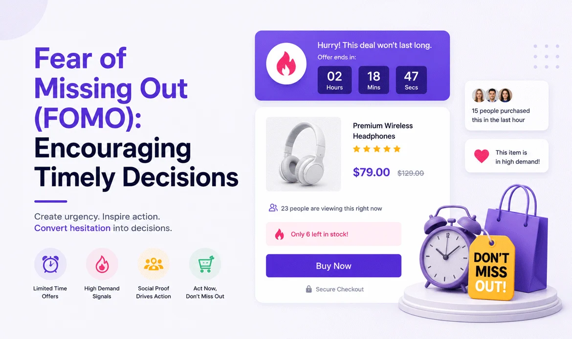
Most people postpone decisions when there is no reason to act immediately.
Urgency changes that behavior.
Limited-time offers, low-stock notifications, and delivery countdowns encourage customers to complete purchases sooner.
However, urgency must always be genuine.
False scarcity damages trust and harms long-term customer relationships.
Good examples include:
- Only 5 items left in stock
- Order within 2 hours for same-day shipping
- Sale ends tonight
- Limited seasonal collection
- Early access pricing
These messages help customers prioritize their purchase instead of delaying it.
⮞ Real Example – Airbnb
When searching for accommodations, Airbnb often displays messages like:
“Only one home left for your selected dates.”
This isn’t manipulation.
It’s helpful information that allows travelers to make informed decisions before availability changes.
⮞ Quick Action Checklist
Before launching or redesigning your ecommerce store, ask yourself these questions:
- Can customers purchase without creating an account?
- Are shipping costs visible before payment?
- Is the payment page mobile-friendly?
- Are trust badges displayed clearly?
- Does the checkout show progress?
- Are forms as short as possible?
- Is the return policy easy to find?
- Are payment methods familiar to customers?
Even small improvements in these areas can significantly enhance user confidence and increase completed purchases.
8. Common Checkout Mistakes That Silently Kill Sales
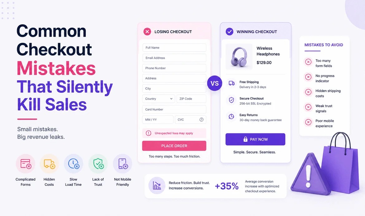
Most businesses don’t lose customers because their products are bad they lose them because the buying process creates unnecessary doubt.
Customers who have already decided to purchase expect the final steps to feel simple and reassuring. When the process becomes confusing or frustrating, many choose to leave and tell themselves they’ll come back later. Unfortunately, many never do.
Here are some of the most common mistakes that reduce completed purchases:
- Forcing account creation before buying.
- Showing shipping charges only at the final step.
- Using lengthy forms with unnecessary fields.
- Displaying confusing error messages.
- Offering too many payment choices without guidance.
- Hiding return and refund information.
- Ignoring mobile users.
- Having slow-loading checkout pages.
Each of these mistakes interrupts the customer’s momentum and increases hesitation.
⮞ Real Example – ASOS
ASOS noticed that many first-time shoppers abandoned their carts because they were required to register before purchasing.
To solve this, the company introduced Guest Checkout. New customers could complete their purchase immediately, while account creation became optional after payment.
This simple change reduced friction and improved customer satisfaction without sacrificing long-term user registrations.
⮞ Mobile Shopping Is No Longer the Future It’s the Present
Think about how often you shop using your phone.
Whether you’re commuting, relaxing on the couch, or waiting in line for coffee, mobile devices have become the preferred way to browse and buy products.
However, many online stores still design their purchase flow primarily for desktop users.
A successful Checkout should feel just as effortless on a smartphone as it does on a computer.
To create a mobile friendly purchasing journey:
- Use large, easy-to-tap buttons.
- Minimize typing with autofill.
- Support Apple Pay, Google Pay, and digital wallets.
- Keep forms short and easy to scan.
- Avoid unnecessary pop-ups.
- Ensure every page loads quickly.
⮞ Real Example – Shop Pay
Shopify’s Shop Pay remembers shipping details and payment information securely for returning customers.
Instead of asking users to fill out the same forms repeatedly, it enables purchases with just a few taps. This significantly reduces friction and creates a faster buying experience.
Businesses aiming for Checkout experience conversion optimization often prioritize mobile improvements because even small usability changes can have a noticeable impact on completed purchases.
9. The Future of Checkout: What Customers Will Expect Next

Online shopping continues to evolve rapidly, and customer expectations are changing with it.
Today’s shoppers expect speed, personalization, and convenience not just competitive pricing.
Some of the trends shaping the future include:
⮞ AI-Powered Personalization
Artificial intelligence can recommend preferred shipping options, remember customer preferences, and simplify repeat purchases.
⮞ Biometric Authentication
Fingerprint and facial recognition are making online payments faster while improving security.
⮞ Voice Commerce
As voice assistants become more capable, shoppers will increasingly complete purchases using simple voice commands.
⮞ One-Tap Payments
Digital wallets continue to reduce the time between deciding to buy and completing a purchase.
⮞ Predictive Forms
Modern systems can automatically fill in addresses and customer details, reducing repetitive typing and minimizing errors.
The businesses that adapt to these trends early will create smoother purchasing journeys and stronger customer loyalty.
⮞ Your Checkout Improvement Checklist
If you’re reviewing your ecommerce store today, use this checklist to identify opportunities for improvement.
⮞ Trust
- SSL certificate installed
- Trusted payment gateways displayed
- Customer reviews visible
- Return policy easy to find
⮞ Simplicity
- Guest purchase option available
- Short forms with only essential fields
- Clear progress indicator
- Logical step-by-step navigation
⮞ Performance
- Fast page loading
- Mobile-friendly design
- Responsive layout
- Optimized images
⮞ Customer Confidence
- Delivery dates displayed
- Shipping costs shown early
- Easy access to customer support
- Clear order summary before payment
Reviewing this checklist regularly helps maintain a smooth buying journey and improves the overall customer experience.
Frequently Asked Questions
1. Why do customers abandon their carts even after deciding to buy?
Most shoppers leave because something creates uncertainty during the buying process. Unexpected costs, complicated forms, security concerns, or too many steps can interrupt their confidence and delay the final decision.
2. Is guest checkout better than mandatory account creation?
Yes. Guest checkout removes unnecessary friction for first-time buyers. Customers who have a positive purchasing experience are often more willing to create an account later.
3. How important are trust badges during online payments?
Trust badges reassure customers that their information is protected. Combined with secure payment gateways and transparent policies, they help reduce perceived risk.
4. Why do progress indicators improve conversions?
Progress indicators show customers how close they are to finishing their purchase. This reduces uncertainty and encourages them to complete the remaining steps.
5. What’s the fastest way to improve an ecommerce checkout?
Start by simplifying the process. Remove unnecessary form fields, display shipping costs early, optimize for mobile devices, and implement WooCommerce checkout optimization best practices to make payment options clear, secure, and easy to use.
Conclusion
Great ecommerce stores don’t succeed because they pressure customers into buying—they succeed because they remove the obstacles that make customers hesitate.
When shoppers reach the final stage of a purchase, they’re looking for reassurance, clarity, and simplicity. Every thoughtful improvement, from shorter forms to visible trust signals, helps reinforce their confidence and encourages them to complete their order.
A well-designed Checkout experience is more than a payment page it’s the final promise your brand makes to every customer. When that promise is fulfilled with speed, transparency, and ease, customers are more likely to return, recommend your business, and become loyal advocates.
Continuous testing, customer feedback, and a commitment to improving the buying journey will always outperform guesswork. Small changes, backed by an understanding of human psychology, can lead to meaningful improvements in conversions and long-term business growth.
Ready to Build a Checkout That Converts More Customers?
A great checkout doesn’t happen by chance—it’s built with the right design, user experience, and performance in mind. If you’re looking for premium WordPress themes that are optimized for speed, seamless shopping experiences, and higher conversions, explore our professionally crafted collection today.