Responsive Design Trends are transforming the way modern websites are built in 2025. As users browse across smartphones, tablets, desktops, and foldable devices, creating a seamless experience has become essential for both user satisfaction and SEO success. From mobile-first indexing to fluid layouts and typography, these design practices ensure websites load faster, adapt better, and rank higher on Google. Businesses that adopt these trends now are not only meeting today’s expectations but also preparing for the future of digital design.
1. Mobile-First Indexing and Core Web Vitals in Responsive Design Trends
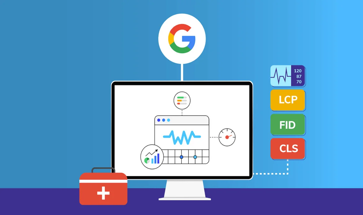
Google’s mobile-first indexing has shifted how websites are designed and ranked. In 2025, performance on mobile devices directly influences search engine positions, meaning mobile optimization is critical. Core Web Vitals such as loading speed, interactivity, and layout stability have become essential ranking signals. A website that fails to optimize for mobile responsiveness will struggle to compete, regardless of how well it performs on desktops. Businesses must now design with a “mobile-first mindset,” ensuring that the user experience is smooth across even the smallest screens.
Pro Tip:
Build responsive layouts that load fast on all devices and pass Google’s performance audits.2. Fluid Grids and Flexible Layouts in Responsive Design Trends
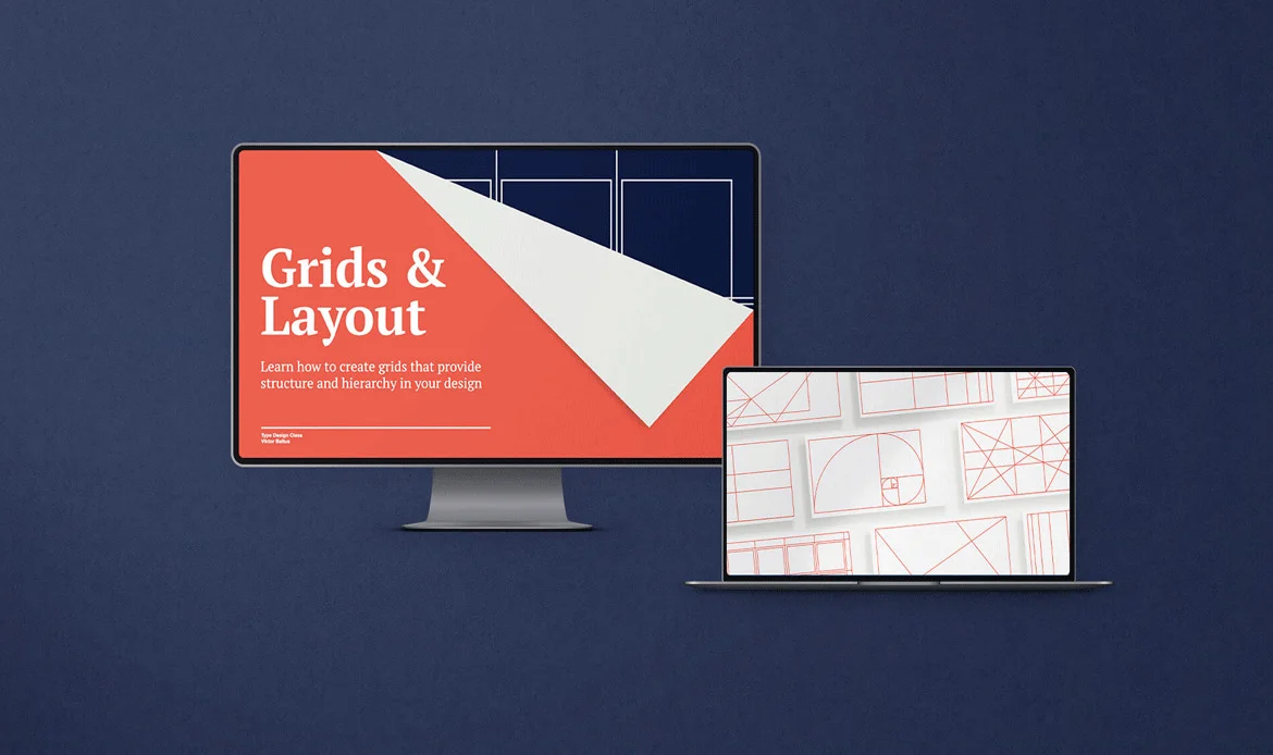
Modern websites are moving away from rigid breakpoints and fixed dimensions. Instead, fluid grids and flexible layouts powered by CSS container queries make designs adaptable to any device size or orientation. This flexibility ensures that content flows naturally, improving visual consistency whether viewed on widescreen monitors or compact foldables. Beyond aesthetics, these layouts have SEO benefits too: they enhance usability, reduce bounce rates, and improve dwell time, which signals search engines that users find value in your website.
SEO Insight:
Flexible layouts reduce bounce rates and increase session duration, both of which improve your rankings for Responsive Design Trends for 2025.3. Foldable and Multi-Screen Compatibility in Responsive Design Trends

The growing popularity of foldable devices and dual-screen experiences has pushed web designers to rethink responsiveness. Instead of focusing solely on one screen, websites must adapt seamlessly when users switch between single and expanded modes. This introduces challenges in design but also opportunities for creating dynamic, multi-pane interfaces. A responsive website in 2025 must not only look good but also feel natural across different orientations and resolutions. Businesses that embrace this trend will gain a competitive edge as foldables become mainstream.
Best Practice:
Test on foldables and tablets to ensure an adaptive, interruption-free browsing experience./
4. Responsive Typography and Variable Fonts in Responsive Design Trends

Typography has become central to modern responsive design. Inconsistent or poorly scaled text can ruin the user experience, especially on smaller devices. In 2025, fluid typography and variable fonts ensure that text automatically adjusts to screen size while maintaining readability and brand identity. This adaptability improves accessibility, enhances aesthetics, and contributes to longer engagement. From a search engine perspective, well-structured, readable typography reduces bounce rates, which directly supports SEO goals. Integrating advanced typographic systems is no longer optional—it’s a necessity for websites targeting growth and visibility.
✔ Key to Responsive Design Trends
In 2025, responsive design places heavy emphasis on responsive typography and variable fonts as a way to create seamless user experiences. Instead of relying on static font sizes, designers now use fluid typography that automatically adjusts to screen dimensions, ensuring that text looks balanced on smartphones, tablets, desktops, and even foldable devices. Variable fonts are another game-changer. Unlike traditional font files that require multiple versions for different weights or styles, a single variable font file can adapt in real time.
✔ Fluid Typography for Seamless Readability in Responsive Design Trends
Responsive typography in 2025 is no longer static. With CSS clamp() and viewport-based units, text automatically scales to fit the device without sacrificing readability. This ensures users have the same smooth reading experience on large desktops, small smartphones, or foldable screens. Websites that adopt this practice not only improve accessibility but also align with Google’s usability signals, strengthening their SEO performance.
SEO Advantage:
High readability improves engagement time, signaling Google that your site deserves better ranking for Responsive Design Trends for 2025.5. Dark Mode and Customizable Themes
User expectations have shifted towards personalization, and responsive design trends now reflect that change. Dark mode, high-contrast themes, and adaptive color palettes are not just aesthetic features but functional enhancements that cater to different user preferences. Customizable themes improve engagement by allowing users to interact with your site the way they prefer, making it more inclusive and user-friendly. This kind of personalization also aligns with Google’s user experience metrics, indirectly boosting SEO rankings.
Quick Tip:
Use CSS custom properties and media queries to deliver responsive theming effortlessly.6. Voice-Friendly and Gesture-Based Navigation

As voice assistants and gesture controls become more integrated into devices, responsive design must evolve beyond visuals to accommodate alternative navigation methods. Websites in 2025 need to be optimized for voice commands, natural language queries, and touch-free browsing experiences. This shift benefits accessibility and opens up new ways to engage users. From an SEO standpoint, optimizing for conversational keywords and structured data gives websites a better chance to appear in voice search results, which are growing rapidly.
SEO Note:
Incorporating structured data and optimizing for conversational search strengthens your presence in Google’s featured snippets for Responsive Design Trends for 2025.7. AI-Powered Responsive Testing and Automation

Artificial intelligence has transformed the way responsive design is tested and deployed. AI-driven tools simulate how websites perform across thousands of devices and screen types in real time, eliminating the need for manual checks. This ensures that websites maintain consistency, performance, and accessibility across all platforms. Automation reduces errors, speeds up design workflows, and enhances user experience, all of which contribute to better SEO performance. By adopting AI in responsive testing, businesses can future-proof their websites and keep up with evolving device ecosystems.
Recommended Tools:
BrowserStack, LambdaTest, and Google Lighthouse.FAQ Section (SEO Boost)
Why is responsive design important for SEO in 2025?
Responsive design ensures mobile-first performance, improves Core Web Vitals, and reduces bounce rates—all factors that directly influence Google rankings.
How do foldable devices affect responsive design?
Foldable smartphones require adaptive layouts that seamlessly transition between different orientations, ensuring usability across all screen types.
What tools help in testing responsive websites?
AI-powered tools like BrowserStack, LambdaTest, and Google’s Mobile-Friendly Test ensure your site meets 2025 responsive standards.
Conclusion
The evolution of Responsive Design Trends highlights the growing demand for adaptable, user-centered websites in 2025. By prioritizing mobile-first experiences, scalable layouts, and accessibility, businesses can improve both engagement and visibility. Staying ahead of these trends ensures your website remains competitive, future-ready, and optimized for search engines. Ultimately, responsive design is no longer just about adjusting to devices—it’s about delivering lasting value to users everywhere.
Stay Ahead with Responsive Design Trends for Modern Websites in 2025
Experience the future of web design with our responsive WordPress themes, perfectly crafted to adapt across every screen and device. In 2025, user experience and mobile performance define success — and our themes are built to deliver both seamlessly.