
In this article, we delve into the world of responsive web design and explore the key principles and practices that empower websites to deliver an optimal user experience.
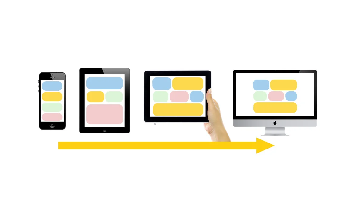
In the fast-paced digital landscape of today, where diverse devices reign supreme, ensuring a seamless and captivating user experience has become a top priority for web designers and developers. As users switch effortlessly between smartphones, tablets, laptops, and desktop computers, the need for websites to adapt and cater to each unique screen size and resolution is undeniable.
This is where the power of responsive wesite design (RWD) comes into play. By harnessing the best practices of responsive websites can transform into versatile and adaptable digital spaces that effortlessly engage users across the device spectrum.
What is Responsive Web Design?
The term “responsive website design” has come to mean a lot of things over the years. It’s a catch-all phrase for any kind of design or development that makes websites work well on mobile devices. But what does that really mean? And how can you make sure your website is responsive? Responsive website design is an approach to web design that makes websites work well on all devices, from phones to laptops to desktop computers. It’s important to note that responsive design is not a single technology or solution. Rather, it’s a combination of many different techniques and processes, all aimed at making websites more usable on mobile devices.Some common features of responsive websites include:
Flexible layouts: Websites are designed to adjust their layout depending on the size of the screen they’re being viewed on. This means that they look good on both large desktop monitors and small phone screens. Resizable images and videos: Images and videos are also designed to resize themselves depending on the size of the screen they’re being viewed on. This ensures that they always look sharp, no matter what device they’re being viewed on. Touch-friendly interfaces: Many responsive websites have been designed with touch screens in mind, giving users an intuitive and enjoyable experience on their phones or tablets.Benefits of Responsive website Design
Responsive website design is a technique for building websites that automatically adapt to the screen size of the user’s device. This ensures that your website will look great and be easy to use no matter what type of device your visitors are using. There are many benefits to using responsive website design, including: Improved User Experience: Responsive website design ensures that your website provides an optimal experience for users no matter what device they are using. This can lead to increased engagement and conversions. Better SEO: Google has stated that responsive website design is their preferred method for building mobile-friendly websites. This means that if you want your website to rank well in search results, you need to make sure it is responsive. Increased Flexibility: With responsive website design, you only need to maintain one website instead of multiple versions for different devices. This can save you time and money in the long run.How to Design a Responsive Website?
When designing a responsive website, there are a few best practices to keep in mind. First, use a responsive layout. This means that your website will resize itself to fit the screen of the device it is being viewed on. Second, use media queries to target different devices. This allows you to change the CSS of your website based on the device it is being viewed on. Third, use fluid grids and images. This means that your website’s layout will change based on the size of the screen it is being viewed on. Fourth, use responsive typography. This means that your website’s text will resize itself to fit the screen of the device it is being viewed on. Test your website on all devices before launch. This will ensure that your website looks its best on all devices.Best Practices for Responsive website Design
Embrace the Mobile-First Approach
 The mobile-first approach is at the core of responsive website design. As mobile devices increasingly dominate internet usage, it makes sense to prioritize the design and functionality for smaller screens initially. By starting with a mobile-first mindset, web designers ensure that the most critical content and features are readily accessible to mobile users, improving overall performance and user satisfaction.
This approach has a number of benefits:
1. It ensures that your website will be accessible and easy to use on a wide range of devices, from small smartphones to large desktop monitors.
2. It allows you to take advantage of the latest mobile technologies and features, such as touchscreens and GPS.
3. It makes it easier to manage your website’s content and keep your design consistent across all devices.
4. It can help you save time and money by reducing the need for separate mobile and desktop versions of your website.
5. It helps you stay ahead of the curve as more and more people access the internet from their mobile devices.
The mobile-first approach is at the core of responsive website design. As mobile devices increasingly dominate internet usage, it makes sense to prioritize the design and functionality for smaller screens initially. By starting with a mobile-first mindset, web designers ensure that the most critical content and features are readily accessible to mobile users, improving overall performance and user satisfaction.
This approach has a number of benefits:
1. It ensures that your website will be accessible and easy to use on a wide range of devices, from small smartphones to large desktop monitors.
2. It allows you to take advantage of the latest mobile technologies and features, such as touchscreens and GPS.
3. It makes it easier to manage your website’s content and keep your design consistent across all devices.
4. It can help you save time and money by reducing the need for separate mobile and desktop versions of your website.
5. It helps you stay ahead of the curve as more and more people access the internet from their mobile devices.
Utilize Fluid Grids and Flexible Layouts
 Gone are the days of rigid and fixed-width layouts. Today, web designers rely on fluid grids and flexible layouts to create responsive websites. By harnessing the power of fluid grids and flexible layouts, web designers can create websites that seamlessly adapt to diverse screen sizes and resolutions, ensuring a harmonious and captivating experience for users across all devices.
Fluid grids and flexible layouts are design techniques that empower web pages to adjust dynamically in response to the user’s screen size. Unlike fixed-width layouts, which remain constant, fluid grids and flexible layouts use relative units such as percentages instead of fixed pixels. This allows elements to resize proportionally, maintaining a harmonious and visually appealing composition on any screen.
Gone are the days of rigid and fixed-width layouts. Today, web designers rely on fluid grids and flexible layouts to create responsive websites. By harnessing the power of fluid grids and flexible layouts, web designers can create websites that seamlessly adapt to diverse screen sizes and resolutions, ensuring a harmonious and captivating experience for users across all devices.
Fluid grids and flexible layouts are design techniques that empower web pages to adjust dynamically in response to the user’s screen size. Unlike fixed-width layouts, which remain constant, fluid grids and flexible layouts use relative units such as percentages instead of fixed pixels. This allows elements to resize proportionally, maintaining a harmonious and visually appealing composition on any screen.
Implement Media Queries Effectively
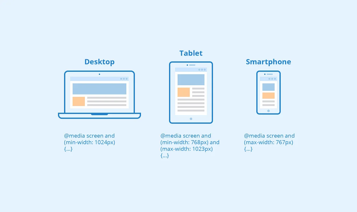 Media queries are CSS rules that enable websites to adapt their appearance based on the user’s device characteristics, such as screen width, resolution, and orientation. Skillfully employing media queries allows web designers to set breakpoints, defining how the website will respond to different screen sizes. By strategically adjusting fonts, layouts, and other design elements, websites can deliver a customized user experience tailored to each device.
No matter what size device someone is using, your website should always look its best. That’s where media queries come in. Media queries are a CSS3 module that allows you to change the styles of your website based on the type of device the visitor is using.
For example, you could use a media query to change the font size on your website if the visitor is using a mobile device. Or, you could use a media query to hide certain elements of your website if the visitor has a screen that is too small to display them.
Media queries are an essential tool for responsive website design, but they can be difficult to implement effectively. In this article, we’ll give you some tips on how to use media queries to create a responsive website that looks great on any device.
Media queries are CSS rules that enable websites to adapt their appearance based on the user’s device characteristics, such as screen width, resolution, and orientation. Skillfully employing media queries allows web designers to set breakpoints, defining how the website will respond to different screen sizes. By strategically adjusting fonts, layouts, and other design elements, websites can deliver a customized user experience tailored to each device.
No matter what size device someone is using, your website should always look its best. That’s where media queries come in. Media queries are a CSS3 module that allows you to change the styles of your website based on the type of device the visitor is using.
For example, you could use a media query to change the font size on your website if the visitor is using a mobile device. Or, you could use a media query to hide certain elements of your website if the visitor has a screen that is too small to display them.
Media queries are an essential tool for responsive website design, but they can be difficult to implement effectively. In this article, we’ll give you some tips on how to use media queries to create a responsive website that looks great on any device.
Optimize Images for Faster Loading
 Images are vital for engaging content, but they can also be a significant factor in slowing down a website’s loading speed. In responsive website design, optimizing images is crucial to ensure fast loading times across all devices.
There are a few things you can do to optimize your images for faster loading:
Images are vital for engaging content, but they can also be a significant factor in slowing down a website’s loading speed. In responsive website design, optimizing images is crucial to ensure fast loading times across all devices.
There are a few things you can do to optimize your images for faster loading:
- Use compressed image formats like JPEG or PNG.
- Resize your images so they’re the appropriate size for the device or screen they’ll be viewed on.
- Use a content delivery network (CDN) to serve your images from a location closer to your users.
- Make sure you’re using caching appropriately so that images don’t need to be downloaded every time a page is loaded.
Prioritize Touch-Friendly Navigation
 It’s no secret that mobile devices are becoming increasingly popular. In fact, over 60% of web traffic now comes from mobile devices. This means that if your website isn’t optimized for mobile, you could be losing a lot of potential customers.
One of the most important aspects of optimizing your website for mobile is to ensure that your navigation is touch-friendly. This means making sure that your menus and buttons are large enough to be easily tapped on a small screen. It also means simplifying your navigation so that users can find what they’re looking for without difficulty.
If you’re not sure how to make your navigation touch-friendly, there are a few things you can do to get started. First, take a look at your website on a mobile device and see how easy it is to use. If it’s difficult to tap on links or buttons, or if the menus are too complicated, then it’s time to make some changes.
Another great way to optimize your navigation for mobile is to use a responsive design framework. These frameworks will automatically adjust your website’s layout and content for different screen sizes, making it much easier to create a touch-friendly interface.
It’s no secret that mobile devices are becoming increasingly popular. In fact, over 60% of web traffic now comes from mobile devices. This means that if your website isn’t optimized for mobile, you could be losing a lot of potential customers.
One of the most important aspects of optimizing your website for mobile is to ensure that your navigation is touch-friendly. This means making sure that your menus and buttons are large enough to be easily tapped on a small screen. It also means simplifying your navigation so that users can find what they’re looking for without difficulty.
If you’re not sure how to make your navigation touch-friendly, there are a few things you can do to get started. First, take a look at your website on a mobile device and see how easy it is to use. If it’s difficult to tap on links or buttons, or if the menus are too complicated, then it’s time to make some changes.
Another great way to optimize your navigation for mobile is to use a responsive design framework. These frameworks will automatically adjust your website’s layout and content for different screen sizes, making it much easier to create a touch-friendly interface.
Focus on Performance Optimization
 When building responsive websites, one of the key considerations is performance. In order to provide an optimal experience for all users, it’s important to focus on performance when designing and developing a responsive website.
There are a number of ways to optimize the performance of a responsive website. One way is to use a content delivery network (CDN). CDNs can help to improve performance by caching static assets and delivering them from servers closer to the user’s location. Another way to improve performance is to minify and compress CSS and JavaScript files. This can reduce the size of files and help them to load faster.
It’s also important to consider the loading time of images when building a responsive website. Images can often be large files, so it’s important to optimize them for web use. This means reducing their file size without reducing quality. There are many tools available that can help with this process.
It’s worth considering using some type of caching solution on your server. This can help to speed up page loading times by storing frequently accessed files in memory or on disk. There are many different caching solutions available, so it’s worth doing some research to find one that will work well for your particular website.
When building responsive websites, one of the key considerations is performance. In order to provide an optimal experience for all users, it’s important to focus on performance when designing and developing a responsive website.
There are a number of ways to optimize the performance of a responsive website. One way is to use a content delivery network (CDN). CDNs can help to improve performance by caching static assets and delivering them from servers closer to the user’s location. Another way to improve performance is to minify and compress CSS and JavaScript files. This can reduce the size of files and help them to load faster.
It’s also important to consider the loading time of images when building a responsive website. Images can often be large files, so it’s important to optimize them for web use. This means reducing their file size without reducing quality. There are many tools available that can help with this process.
It’s worth considering using some type of caching solution on your server. This can help to speed up page loading times by storing frequently accessed files in memory or on disk. There are many different caching solutions available, so it’s worth doing some research to find one that will work well for your particular website.
Embrace Negative Space
In the world of web design, every pixel counts. Crafting a visually stunning and user-friendly website is a delicate balance between content and whitespace. While content is crucial, it’s often the negative space, also known as whitespace, that can make or break a responsive website design. Embracing negative space is a design philosophy that can transform your website from cluttered and confusing to elegant and effective. In responsive website design, where screen sizes vary across devices, embracing negative space becomes even more critical. By strategically utilizing negative space, designers can adapt the layout gracefully to different screen sizes without compromising on aesthetics or functionality. When elements have ample space around them, text and images become more legible, enhancing the overall user experience. It ensures that users can quickly scan through the content, making your website more user-friendly.Focus on Content Prioritization
 Content prioritization is a fundamental aspect of responsive website design that ensures users receive a captivating and personalized experience, regardless of the device they use. In this blog post, we delve into the importance of content prioritization and share best practices for optimizing your responsive design to deliver valuable and engaging content to every visitor.
Content prioritization lies at the heart of successful responsive website design. By focusing on what matters most to your users and strategically organizing content, you can create engaging and user-friendly websites that leave a lasting impression. A well-implemented content prioritization strategy not only improves user experience but also enhances mobile performance and boosts conversion rates.
Embrace the power of content prioritization, and your responsive website design will become a valuable asset, delighting users on every device they choose to explore your digital realm.
Content prioritization is a fundamental aspect of responsive website design that ensures users receive a captivating and personalized experience, regardless of the device they use. In this blog post, we delve into the importance of content prioritization and share best practices for optimizing your responsive design to deliver valuable and engaging content to every visitor.
Content prioritization lies at the heart of successful responsive website design. By focusing on what matters most to your users and strategically organizing content, you can create engaging and user-friendly websites that leave a lasting impression. A well-implemented content prioritization strategy not only improves user experience but also enhances mobile performance and boosts conversion rates.
Embrace the power of content prioritization, and your responsive website design will become a valuable asset, delighting users on every device they choose to explore your digital realm.
Design and assess a prototype with responsiveness in Mind
 A responsive prototype serves as a blueprint for the final website, allowing designers and stakeholders to visualize the layout and functionality in a tangible form. By designing with responsiveness in mind from the outset, you lay the foundation for a smooth and consistent user experience across diverse devices.
Assessing the prototype throughout the development process ensures that potential issues are addressed early on, saving time and resources in the long run. By consciously designing with responsiveness in mind during the prototyping phase, you set the stage for a responsive website design that meets users’ expectations, regardless of their device preferences.
A responsive prototype serves as a blueprint for the final website, allowing designers and stakeholders to visualize the layout and functionality in a tangible form. By designing with responsiveness in mind from the outset, you lay the foundation for a smooth and consistent user experience across diverse devices.
Assessing the prototype throughout the development process ensures that potential issues are addressed early on, saving time and resources in the long run. By consciously designing with responsiveness in mind during the prototyping phase, you set the stage for a responsive website design that meets users’ expectations, regardless of their device preferences.
Test Across Multiple Devices and Browsers
 When it comes to responsive website design, one of the most important things to keep in mind is the need to test your site across multiple devices and browsers. The reason for this is that various devices and browsers may render your site differently, and you aim to ensure that your site appears and functions at its best, regardless of the viewing platform.
There are a few different ways that you can go about testing your responsive site. One option is to use a tool like BrowserStack, which allows you to test your site across a wide range of devices and browsers. Another option is to physically test your site on as many different devices and browsers as possible. And finally, you can also use Google’s Mobile-Friendly Test tool to get a quick overview of how your site looks on mobile devices.
Whichever method you choose, testing is essential to ensuring that your responsive website design is up to par. By taking the time to test early and often, you can head off any potential problems and make sure that your site is looking its best for all users.
When it comes to responsive website design, one of the most important things to keep in mind is the need to test your site across multiple devices and browsers. The reason for this is that various devices and browsers may render your site differently, and you aim to ensure that your site appears and functions at its best, regardless of the viewing platform.
There are a few different ways that you can go about testing your responsive site. One option is to use a tool like BrowserStack, which allows you to test your site across a wide range of devices and browsers. Another option is to physically test your site on as many different devices and browsers as possible. And finally, you can also use Google’s Mobile-Friendly Test tool to get a quick overview of how your site looks on mobile devices.
Whichever method you choose, testing is essential to ensuring that your responsive website design is up to par. By taking the time to test early and often, you can head off any potential problems and make sure that your site is looking its best for all users.
Tools and Resources for Responsive website Design
Tools and resources for responsive website design are constantly evolving, but there are a few key tools and resources that remain essential for any responsive website designer. One of the most important tools for responsive website design is a good code editor. A code editor will help you write and edit your HTML, CSS, and JavaScript code. Some popular code editors include Sublime Text, Atom, and Brackets. Another essential tool for responsive website design is a good CSS preprocessor. CSS preprocessors can help you write more efficient and maintainable CSS code. Some popular CSS preprocessors include Sass, Less, and PostCSS. In addition to these essential tools, there are a number of other helpful resources for responsive website design. These include pattern libraries like Bootstrap and Foundation, front-end frameworks like AngularJS and ReactJS, and icon libraries like Font Awesome and Material Design Icons.FAQs on Responsive Web Design Tips for Seamless User Experience
What are the key elements of a responsive web design?
The main elements of responsive web design include flexible grids, fluid images, and CSS media queries. These components work together to ensure your website automatically adjusts to fit any screen size, providing an optimal user experience on all devices.
Why is mobile-first design important for responsiveness?
A mobile-first approach ensures your website performs well on smaller screens before scaling up for larger devices. This method improves load times, user engagement, and SEO rankings, as search engines prioritize mobile-friendly websites.
How can I test if my website is truly responsive?
You can test your website’s responsiveness by resizing your browser window, using Chrome DevTools’ device simulator, or running a Google Mobile-Friendly Test. These tools help identify layout or performance issues across different devices and resolutions.
The Bottom Line
In conclusion, mastering the art of responsive website design is the key to unlocking a world of seamless and engaging user experiences. By adhering to the best practices outlined in this guide, we have empowered our websites to adapt gracefully to every device, ensuring that users can explore and interact effortlessly. From the mobile-first approach to media queries, image optimization, and touch-friendly navigation, each practice plays a pivotal role in delivering an optimal user experience.
As we continue to navigate the ever-evolving digital landscape, responsive website design remains at the forefront of user-centricity. By embracing these principles and continuously refining our designs, we pave the way for websites that transcend boundaries and captivate users on every screen.
Build a Website That Looks Perfect on Every Device
Top WordPress themes like Miion, Interiar, Gigas, and Seoaal are designed with responsive layouts, flexible grid systems, and interactive elements that maintain visual integrity across every screen size. Combine these with fast-loading pages, optimized images, and touch-friendly interfaces to provide a smooth and professional experience for all visitors.