Welcome to the forefront of digital innovation with our comprehensive guide to UX Design Best Practices for the year 2025. In this rapidly evolving landscape, delivering exceptional user experiences isn’t just a preference – it’s a necessity.
Whether you’re a seasoned designer or a newcomer to the field, staying attuned to the latest strategies and techniques is essential for creating interfaces that captivate, engage, and leave a lasting impression. As technology continues to reshape how we interact with the virtual world, our guide equips you with the knowledge needed to craft interfaces that seamlessly adapt across devices and platforms.
Drawing from real-world case studies and insights from leading UX visionaries, our guide isn’t just about theory – it’s a hands-on resource that empowers you to implement these best practices effectively. Whether you’re looking to elevate your e-commerce platform, redefine mobile app experiences, or rejuvenate your blog’s interface, our guide has you covered.
What is UX Design?
User Experience (UX) Design is a multidisciplinary approach that focuses on creating products, services, or digital interfaces that are user-centered and optimized for positive interactions. It involves understanding and empathizing with users’ needs, preferences, and behaviors to design solutions that are intuitive, efficient, and enjoyable to use. UX designers aim to enhance the overall experience users have when interacting with a product or service, whether it’s a website, mobile app, software, or physical device. Ultimately, UX design aims to align user goals with business objectives, resulting in a win-win scenario where users have satisfying experiences, and businesses achieve their desired outcomes. It’s about fostering a deep understanding of users and translating that understanding into designs that not only meet but exceed their expectations, leading to meaningful and lasting connections between users and the products or services they interact with.Exploring the Significance of UX Design Principles
 Why not trust your instincts and create designs as you please? Primarily because effective design isn’t about you; it’s about your audience. As a UX designer, your role revolves around minimizing obstacles within the user experience, and these obstacles are constantly shifting.
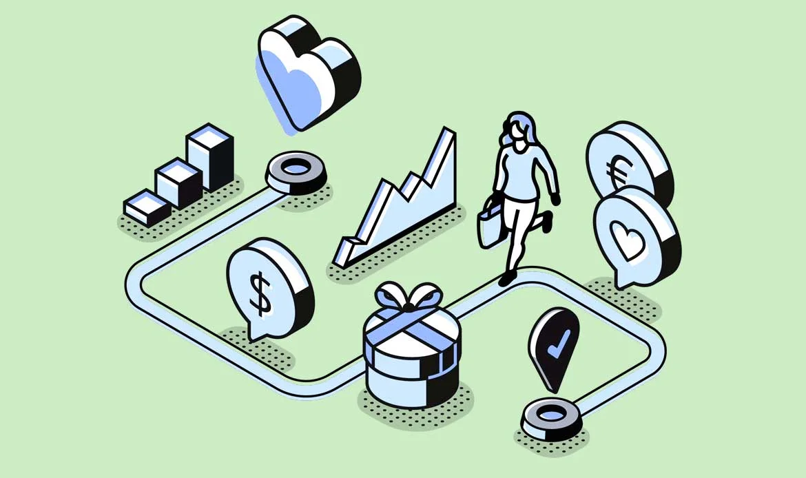
However, the encouraging news is that substantial research on how to overcome these obstacles has already been conducted. You don’t need to reinvent the wheel. By incorporating robust UX design best practices into your website, product, or application, you can expect to reap the following advantages:
Increased Traffic: A website boasting excellent UX distinguishes itself from the competition and attains higher rankings in search results.
Enhanced Checkout and Completed Journeys: Your aim is to guide users towards acquiring knowledge, making decisions, and accomplishing tasks. If your website introduces friction, you’ll notice higher rates of abandonment.
Elevated Customer Satisfaction: When your website or product resonates with users, they’re more inclined to return repeatedly.
When these benefits amalgamate, you can anticipate meeting user needs and becoming an indispensable part of their daily lives.
Why not trust your instincts and create designs as you please? Primarily because effective design isn’t about you; it’s about your audience. As a UX designer, your role revolves around minimizing obstacles within the user experience, and these obstacles are constantly shifting.
However, the encouraging news is that substantial research on how to overcome these obstacles has already been conducted. You don’t need to reinvent the wheel. By incorporating robust UX design best practices into your website, product, or application, you can expect to reap the following advantages:
Increased Traffic: A website boasting excellent UX distinguishes itself from the competition and attains higher rankings in search results.
Enhanced Checkout and Completed Journeys: Your aim is to guide users towards acquiring knowledge, making decisions, and accomplishing tasks. If your website introduces friction, you’ll notice higher rates of abandonment.
Elevated Customer Satisfaction: When your website or product resonates with users, they’re more inclined to return repeatedly.
When these benefits amalgamate, you can anticipate meeting user needs and becoming an indispensable part of their daily lives.
Chapter 1: The Foundations of User-Centered Design
Understanding User Personas
User personas are the cornerstones of user-centered design. Understanding user personas is a foundational concept in user-centered design. User personas are fictional representations of different types of users who might engage with a product, service, or platform. These personas are not randomly created but are based on thorough research, data analysis, and user insights. A well-developed user persona includes various characteristics such as age, gender, occupation, education, interests, and more. These details help humanize the user groups and provide a comprehensive understanding of their backgrounds. User personas go beyond demographic information. They delve into the behaviors and actions users might take when interacting with a product. This includes how frequently they use the product, what features they prioritize, and their typical user journey.The Role of Empathy in UX Design
Empathy is the driving force behind exceptional user experiences. The role of empathy in UX (User Experience) design is pivotal. It’s the practice of understanding and sharing the feelings, needs, motivations, and behaviors of users. Empathy enables designers to connect deeply with users and create experiences that truly resonate with their emotions and requirements. Empathy involves putting yourself in the users’ shoes. By doing so, designers can uncover needs that might not be immediately apparent through quantitative data. This deeper understanding helps design products that solve real problems. By understanding users’ feelings, behaviors, and motivations, designers create experiences that are not only functional but also emotionally resonant. This approach leads to products that are more impactful, user-focused, and ultimately successful.Chapter 2: Crafting Intuitive User Journeys
Designing Seamless User Flows
User flows are the paths users take through your website or application. Discover how to create intuitive user flows that guide users effortlessly from one interaction to another, ensuring a cohesive and engaging experience. Designing seamless user flows is a critical aspect of user experience (UX) design, ensuring that users can navigate through a digital interface smoothly and achieve their goals with minimal friction. A user flow refers to the sequence of steps a user takes to complete a specific task or achieve a particular goal within a website, app, or digital platform. User flows begin with ensuring that users can easily find their way around the interface. Clear navigation menus, buttons, and links guide users to different sections and functionalities. In essence, designing seamless user flows is about orchestrating a guided journey for users as they interact with digital interfaces. It ensures that users can navigate, complete tasks, and achieve goals effortlessly, contributing to a positive and effective user experience.The Magic of Microinteractions
Microinteractions are subtle, yet powerful, design elements that add a touch of interactivity and charm to user experiences. They consist of small, contained animations or responses that occur in response to user actions or system events. Despite their seemingly minor nature, microinteractions play a significant role in enhancing user engagement, providing feedback, and creating a delightful overall experience. Microinteractions engage users by acknowledging their actions. For example, a button changing color when hovered over or a subtle sound when a notification arrives. These small responses provide feedback, reassuring users that their actions have been recognized. Microinteractions add a human touch to digital interfaces, making them feel more relatable and approachable. They mimic real-world interactions, such as the tactile feedback of pressing a physical button.Navigating Information Architecture
Organizing content in a logical and intuitive manner is essential for a smooth user experience. Navigating information architecture involves organizing and structuring content within a digital interface to create a logical and intuitive user experience. Information architecture (IA) is the backbone of a well-organized website, app, or platform, ensuring that users can find information easily and navigate through different sections without confusion. Information architecture is like the blueprint of a building. It determines how content is organized, categorized, and presented to users. This organization should reflect users’ mental models, making it easier for them to understand and navigate.Chapter 3: Balancing Aesthetics and Functionality

The Form and Function
Balancing aesthetics and functionality refers to the challenge designers encounter when trying to create a design that is both visually appealing and practical in its use. It involves finding the right equilibrium between the artistic and creative aspects of a design and the pragmatic requirements for user interaction and usability. Aesthetics: Aesthetics encompasses the visual appeal, beauty, and artistic elements of a design. This includes factors like color schemes, typography, layout, imagery, and overall visual harmony. Functionality: Functionality relates to how well a design performs its intended purpose and how effectively users can interact with it. It prioritizes usability, ease of navigation, and the ability to accomplish tasks efficiently. The Balance: The concept of balancing aesthetics and functionality recognizes that these two aspects often seem to conflict with each other. Designers must find a way to incorporate both without one aspect undermining the other. In essence, balancing aesthetics and functionality is about creating designs that are not only visually pleasing but also highly functional and user-friendly. It involves understanding the interplay between these two aspects and making strategic choices that result in an effective and engaging user experience.Typography and Readability
Typography isn’t just about choosing fonts – it’s about making content readable and enjoyable. Typography and readability are essential elements in design, especially in written content, where the choice of fonts, styles, and layouts significantly impacts how easily users can consume and understand the text. Typography refers to the art and technique of arranging type (text) in a visually appealing and effective manner. It involves selecting fonts, adjusting their size, spacing, and alignment to create harmonious and readable text. The choice of fonts plays a crucial role in typography. Fonts can convey different tones, moods, and messages. Designers select fonts that align with the content’s purpose and audience while ensuring readability. Proper use of whitespace (empty space around and within text) enhances readability by preventing visual clutter and providing a comfortable reading experience.The Power of Visual Hierarchy
Visual hierarchy directs users’ attention to the most important elements of a design. By making certain elements stand out more than others, designers can guide users to focus on key messages, actions, or information. The power of visual hierarchy lies in its ability to guide users’ attention, organize content, and communicate information effectively within a design. Visual hierarchy is a design principle that involves using various design elements, such as size, color, contrast, and positioning, to create a structured order of importance and guide users through the content in a meaningful way. Visual hierarchy involves manipulating typography (font styles, sizes, colors) and imagery (visual cues, icons, graphics) to guide users through content in a meaningful way.Chapter 4: Embracing Accessibility and Inclusivity
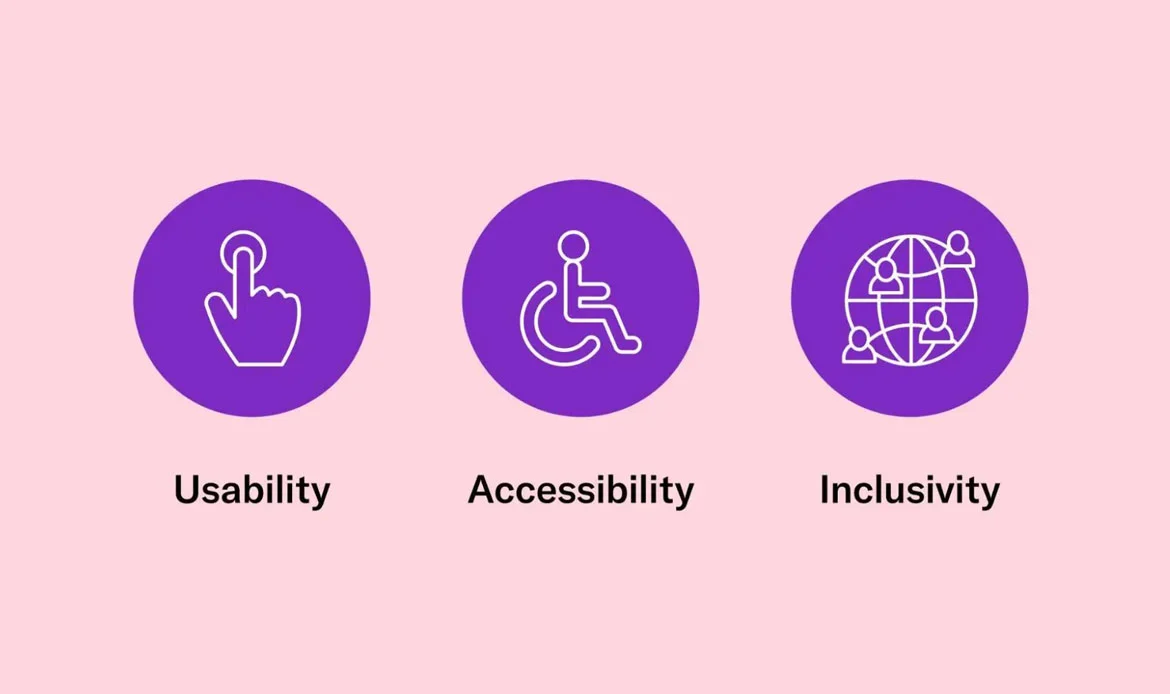
Designing for All: The Importance of Accessibility
Inclusion is at the heart of great design. We’ll dive deep into accessibility, discussing how to make your designs usable by everyone, regardless of disabilities. From color contrast to screen reader compatibility, you’ll gain insights into creating truly inclusive experiences. Web Content Accessibility Guidelines (WCAG): WCAG provides a comprehensive set of guidelines to make web content more accessible. It covers aspects like text alternatives for images, keyboard navigation, color contrast, and more. Designing with accessibility benefits a broader user base, including elderly users, people with temporary impairments (due to injury), and those using older devices or slower connections.Mobile-First and Responsive Design
Mobile-first design involves creating the mobile version of a website or app before designing for larger screens like desktops or tablets. This approach prioritizes the needs of mobile users and adapts the design to fit smaller screens. More users access the internet via mobile devices than ever before. Designing for mobile acknowledges this trend and ensures a seamless experience for the majority of users. Responsive design provides a consistent user experience regardless of the device used. Users should be able to access the same content and features seamlessly. Adapting to Future Devices: New devices with different screen sizes and form factors are constantly emerging. Responsive design prepares your content to adapt to these changes.Chapter 5: Putting It All Into Practice
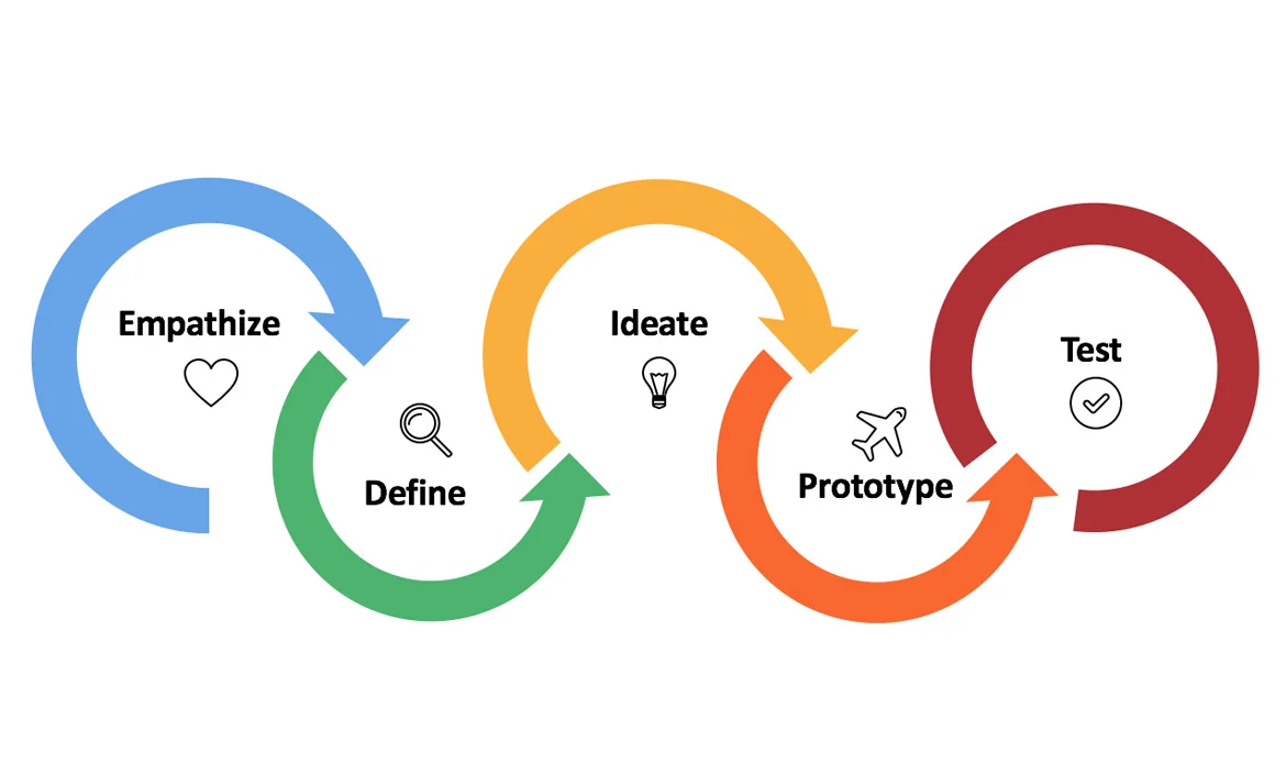
User Testing and Iteration
User testing and iteration are essential components of the design process, involving the systematic evaluation of a design with real users and making iterative improvements based on their feedback. This iterative approach is crucial for creating user-centered designs that effectively meet users’ needs and preferences. User testing provides insights into how users perceive, navigate, and use a product. It helps identify areas of confusion, usability issues, and user preferences. Design isn’t static – it’s a continuous process of improvement. Learn how to gather feedback, analyze user behavior, and refine your designs for optimal user satisfaction.Collaboration and Communication in Design Teams
Collaboration and communication are essential pillars of successful design teams, fostering effective teamwork, creativity, and the development of well-rounded design solutions. These practices enable designers to work together efficiently, share ideas, and create cohesive designs that align with project goals. Designers with different skills and expertise collaborate to combine their strengths and create holistic solutions. This includes graphic designers, UX/UI designers, researchers, developers, and more. They enable designers to leverage each other’s strengths, create well-rounded designs, and ensure that the final product meets both user needs and project objectives. Effective teamwork and open communication contribute to the overall success of design projects.Staying Ahead of UX Trends
The landscape of UX design is always evolving. Staying ahead of UX trends involves a proactive approach to learning, adapting, and innovating. By embracing new technologies, anticipating user expectations, and keeping up with emerging design practices, designers can create experiences that resonate with users and remain relevant in an ever-changing digital landscape.Frequently Asked Questions About Modern UX Design Practices
What are the key elements of an effective UX design in 2025?
The most effective UX designs in 2025 emphasize personalization, accessibility, responsive interfaces, and emotional engagement. Designers are leveraging AI-driven insights, voice interfaces, and adaptive layouts to create intuitive user journeys that meet evolving digital expectations.
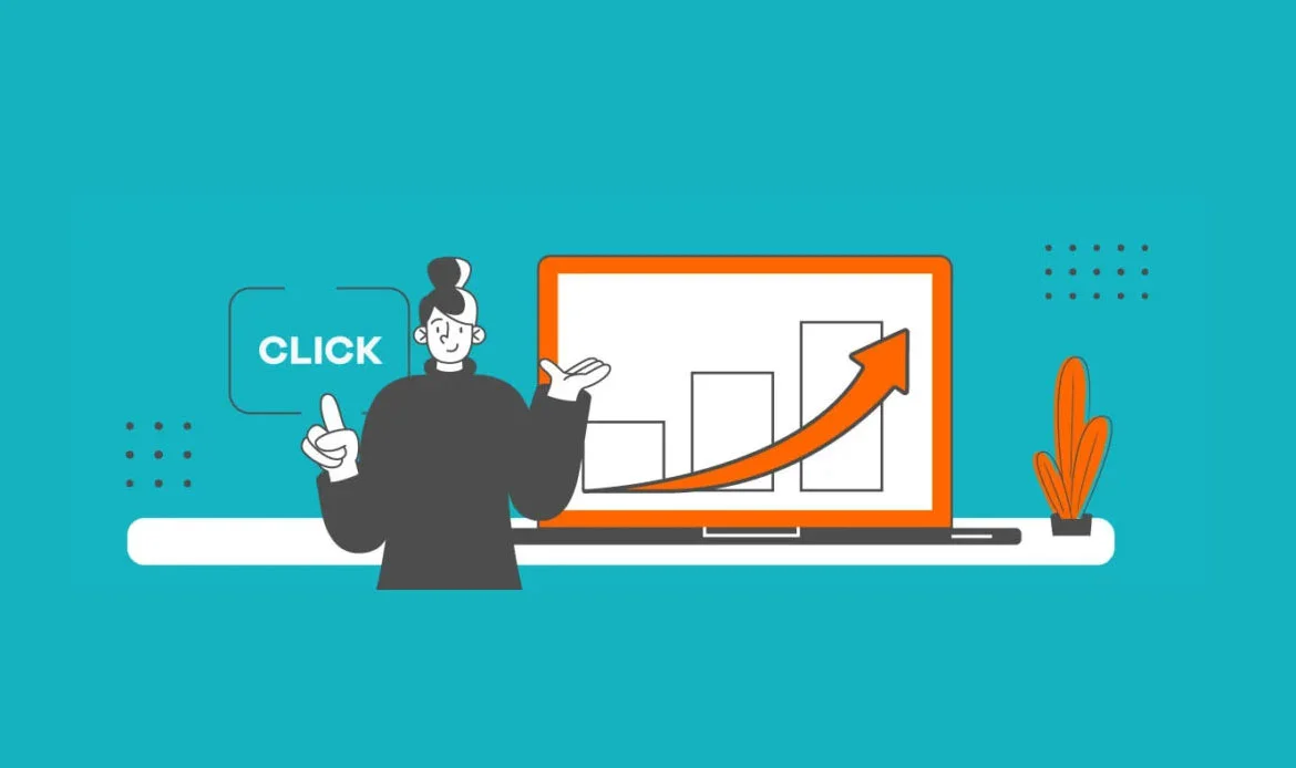
How does UX design impact website performance and conversions?
A strong UX design enhances user satisfaction, reduces bounce rates, and improves overall engagement. Clear navigation, fast-loading pages, and accessible design elements encourage visitors to stay longer and take desired actions, directly boosting conversion rates.
Which tools and trends should UX designers focus on in 2025?
UX designers in 2025 should focus on tools like Figma, Adobe XD, and Maze for collaborative prototyping and testing. Emerging trends include AI-based user behavior analysis, micro-interactions, dark mode optimization, and inclusive design that accommodates all users.
Conclusion
In the dynamic landscape of digital experiences, mastering UX design is your key to unlocking user-centric brilliance. The strategies and insights shared in our guide empower you to create interfaces that resonate, engage, and simplify the complex. As you conclude your journey through this comprehensive guide, remember that each pixel, interaction, and decision has the power to shape the way users engage with the digital world. By embracing empathy, creativity, and the latest industry insights, you’re poised to craft interfaces that not only meet users’ needs but also ignite their imaginations. As technology continues to evolve, your dedication to user-centric design will ensure that you remain at the forefront of digital innovation, transforming the ordinary into the extraordinary with every design you create.Elevate User Experience with Proven UX Design Practices!
In 2025, user experience isn’t just about looks — it’s about creating seamless, intuitive, and emotionally engaging interactions. Choosing premium, high-quality themes built with UX in mind helps your site look professional and perform flawlessly in 2025.